Product Design
Primer
Primer had just shifted from an after-school program to full-time K–8 microschools, and its product hadn't caught up. Teachers were piecing their day together from a handful of learning apps and outside tools, and students often didn't know what they should be working on. As part of our team's multi-year partnership with Primer, I helped design the platform that brought it all together: one place for students to learn, teachers to teach, and the classroom to run.
The problem
A Primer school day has a lot of moving parts. Students work through goals in several learning apps, each one tracking progress differently, while also attending in-person classes, online small groups, and project-based work. Teachers had to check each app separately to see how students were doing, and they relied on outside tools to fill the gaps. Our job was to turn all of that into one platform built for how a microschool actually runs.
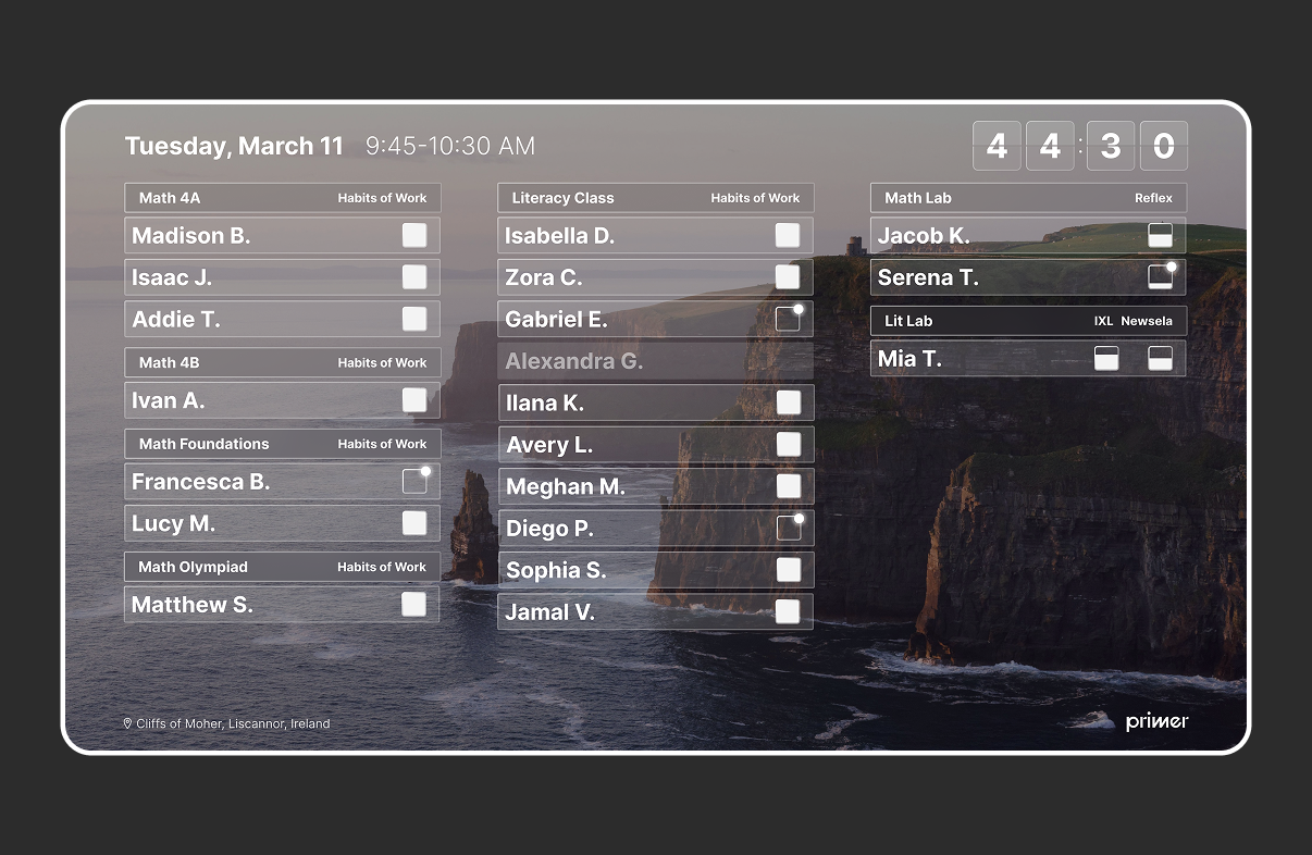
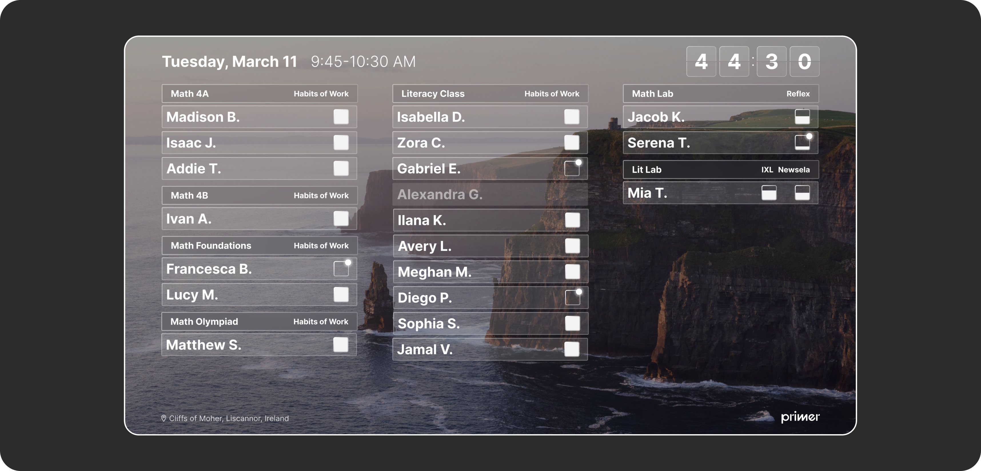
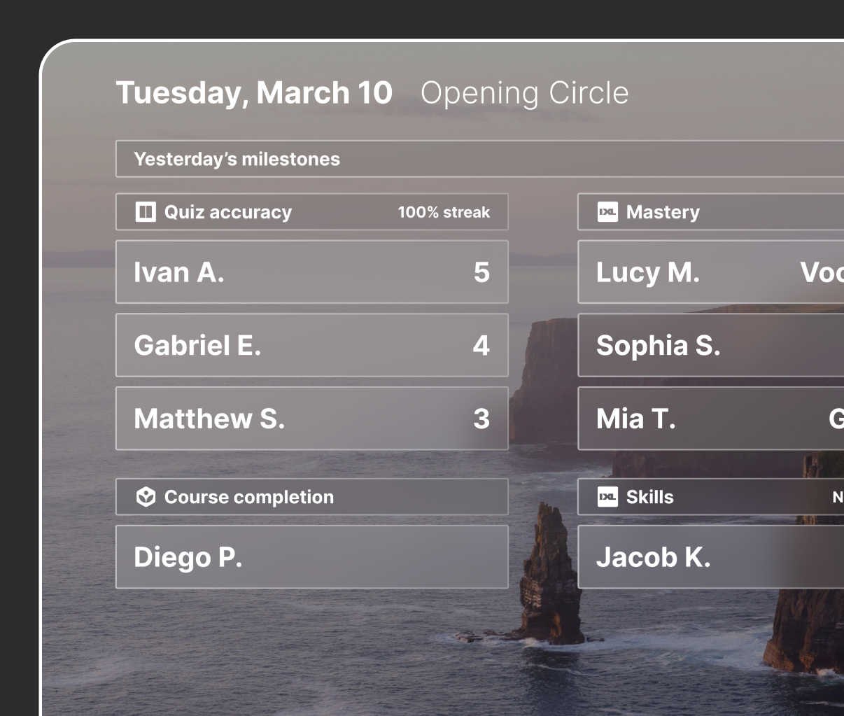
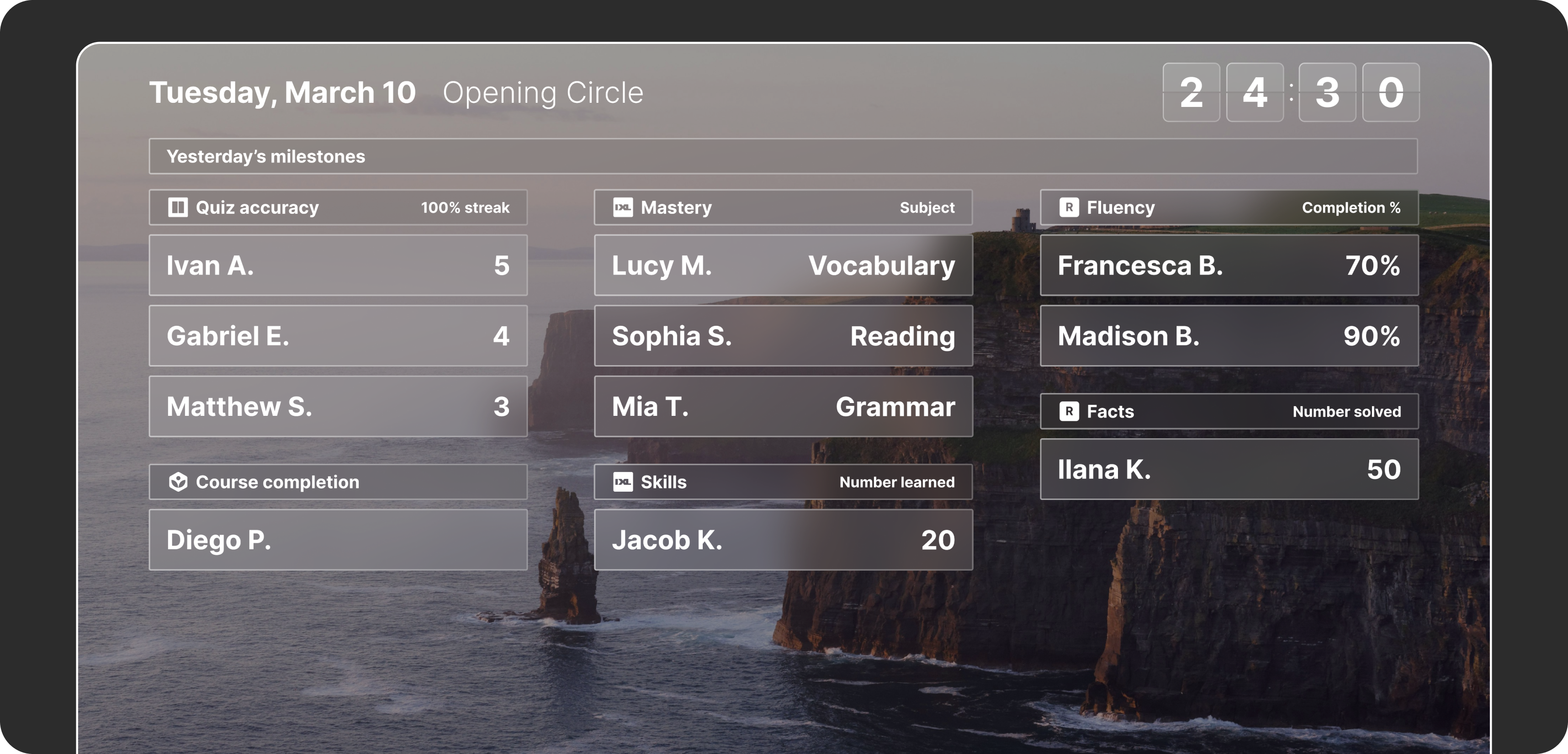
Stage gave teachers the ability to see who in their classroom was on or off track with their goals for each class throughout the day.
Stage: the classroom on the big screen
Teachers needed to know how the class was doing without being tethered to their desk. Stage puts the information they need to see on the board at the front of the room: which class each student is in, how much time is left, and how everyone is tracking on their daily goals.
I did most of the visual design for Stage. We went through many iterations on what information to show, and each round made it clearer that less was more. The final version is the simplest one, designed so a teacher can glance up from anywhere in the room and know how the class is doing. The Primer team liked the versions with video or photography in the background like a screensaver design, so we moved away from something more branded, and continued to push the photo version until we achieved the final look.
Designing for a large screen meant thinking about scale in a way a laptop screen can't show. I AirPlayed my designs to my own TV at home so I could see them from across a room, checking that type, colors, and progress indicators read clearly at a distance.
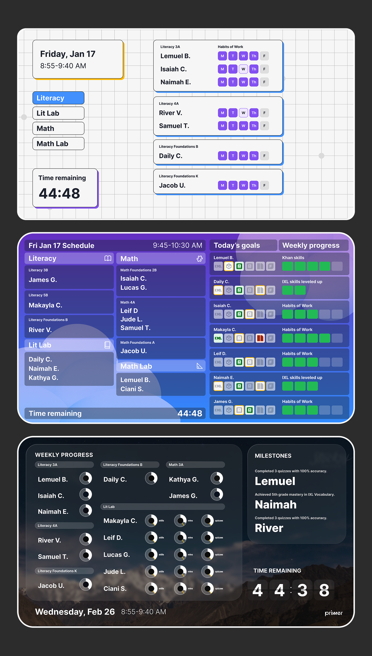
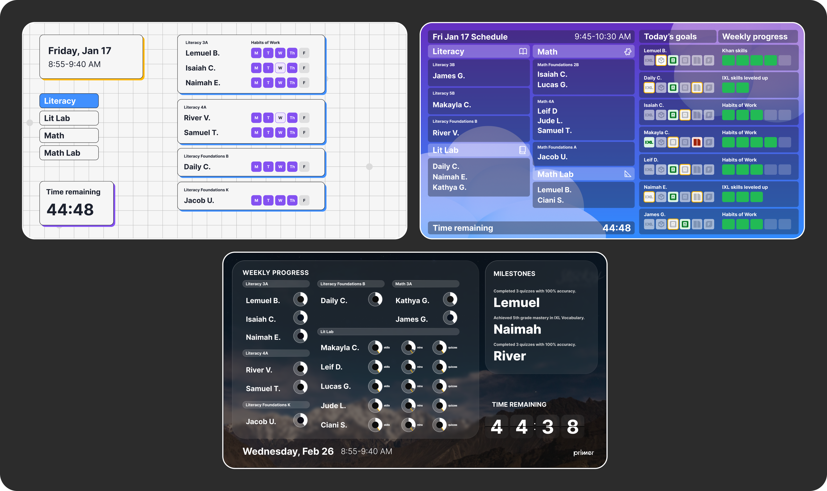
A few of the visual variations that we went through on the journey to the final version of Stage. We tried a few branded options, and various data displays.
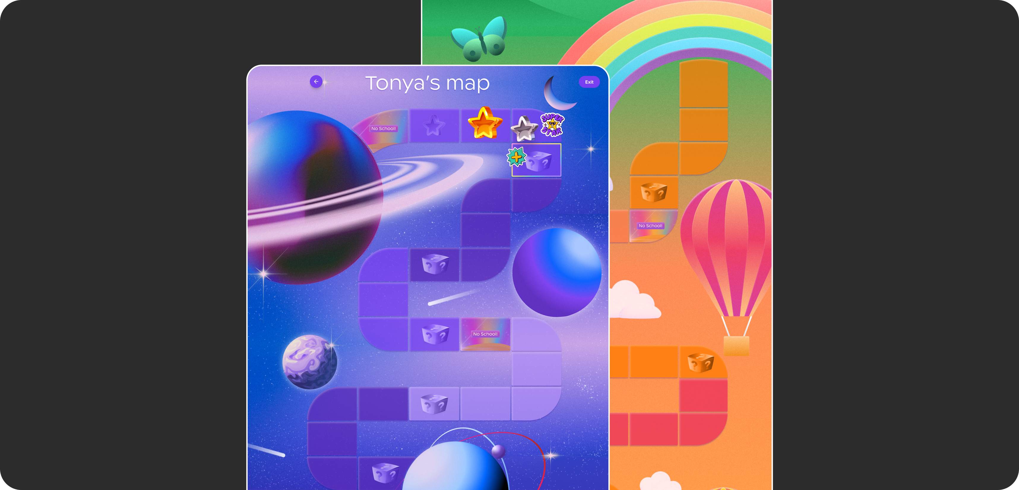
The map would lead students through each day and allow them to place digital stickers as they went.
Rewards: from a map to a store
To help students stay motivated, we first designed a rewards map inspired by Candyland. As students moved through each session (Primer has six or seven a year), the map's scenery changed to show a new part of the journey. Students collected digital stickers along the way and unlocked rewards at the end of each week.
Students liked it in testing, but it didn't hold up in everyday use. The digital stickers lost their appeal over time, and many teachers already had their own reward systems that worked well for them, so they didn't adopt it.
So we pivoted to a rewards store. Students earn coins by completing their goals and spend them on digital and physical rewards. The school provides physical items, and teachers can add their own, so the store works alongside the systems teachers already had instead of replacing them. Students especially loved rewards they could add to their screens, like badges, cursor trails, and custom backgrounds.
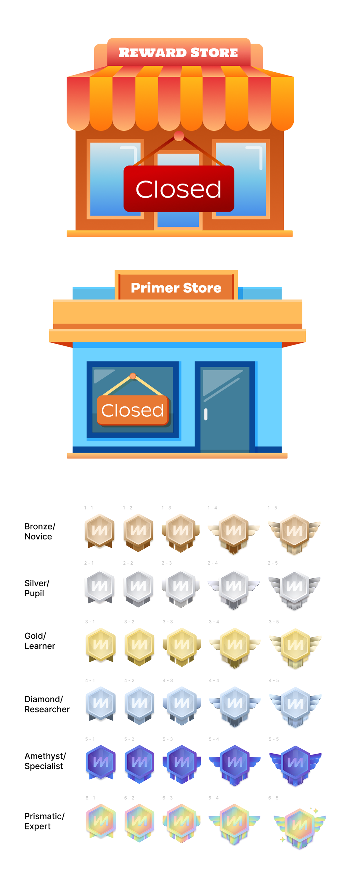
The store was designed by another designer on the team, but I illustrated the coins, the badges, and the "store closed" screens, the pieces that gave the store its personality and gave students something fun to collect.
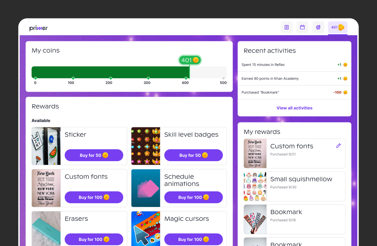
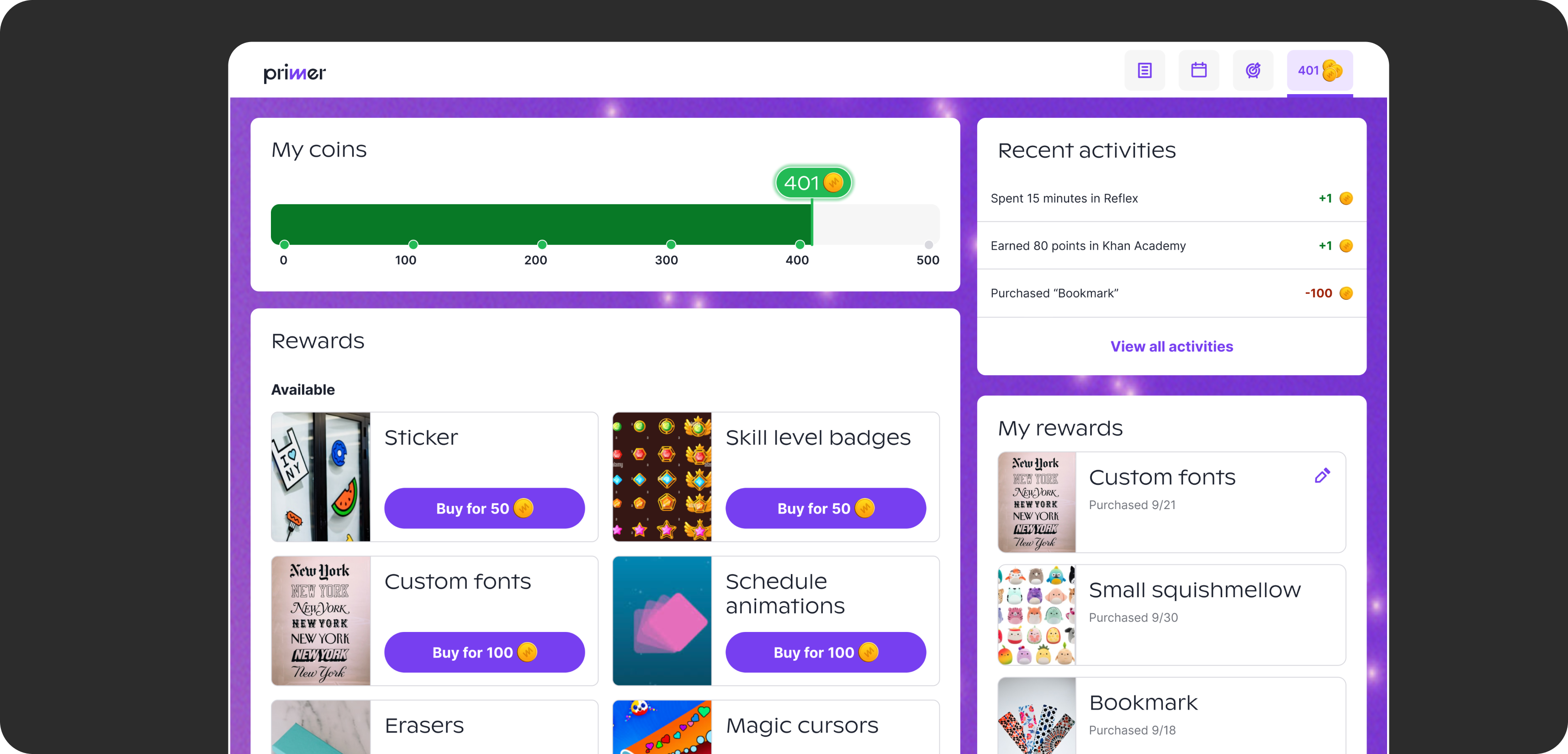
The reward store was much more successful with students and teachers.
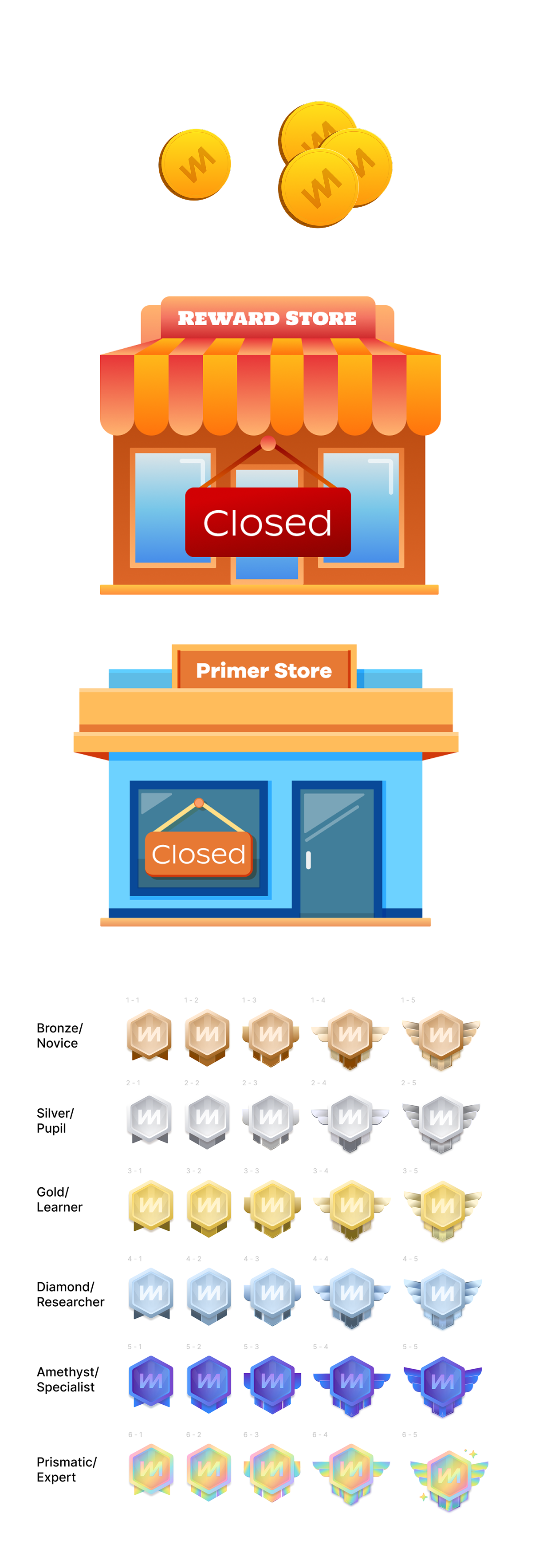
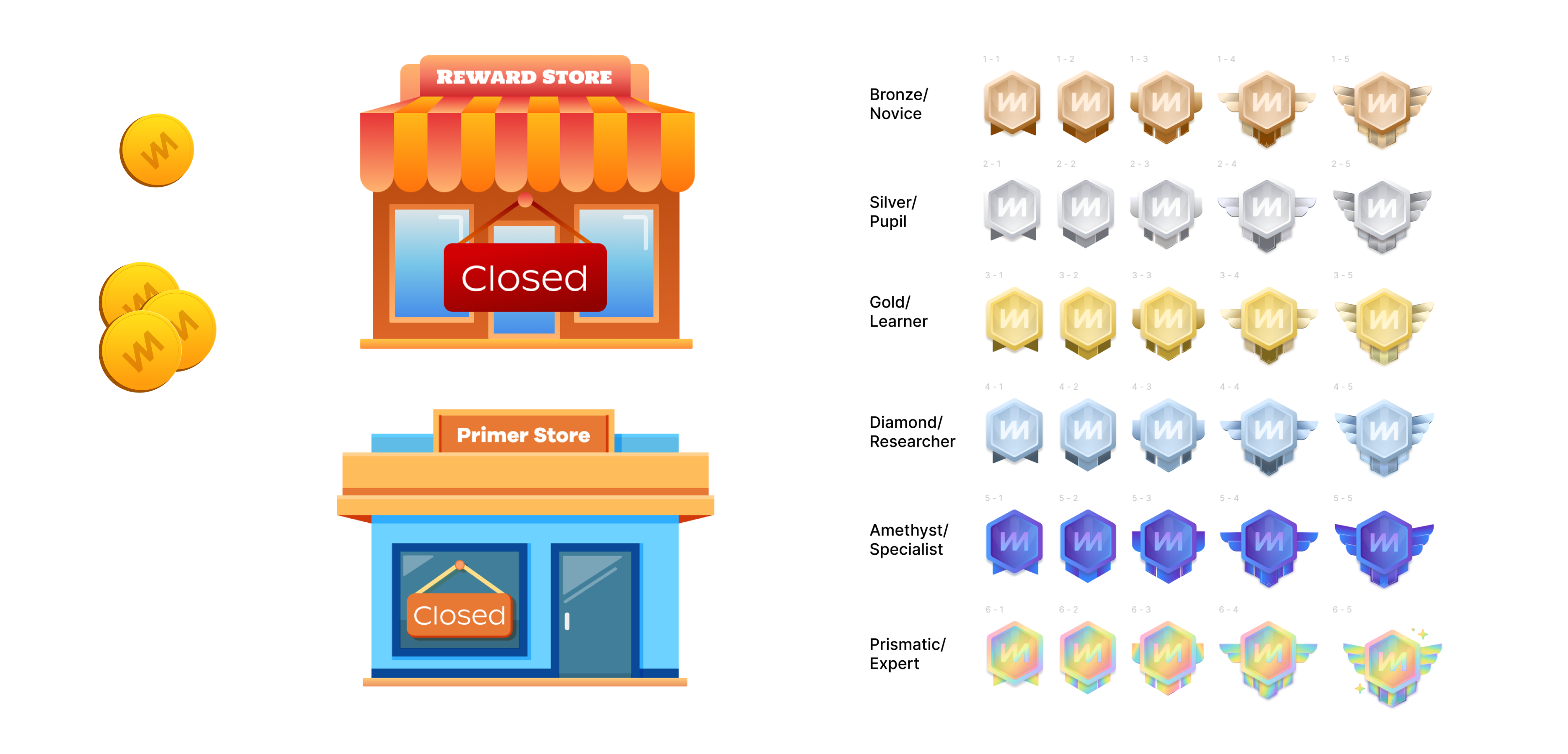
I illustrated the coins for the store that are seen across the student experience, the store closed visuals, and a set of badges that students could purchase and add to their dashboard.
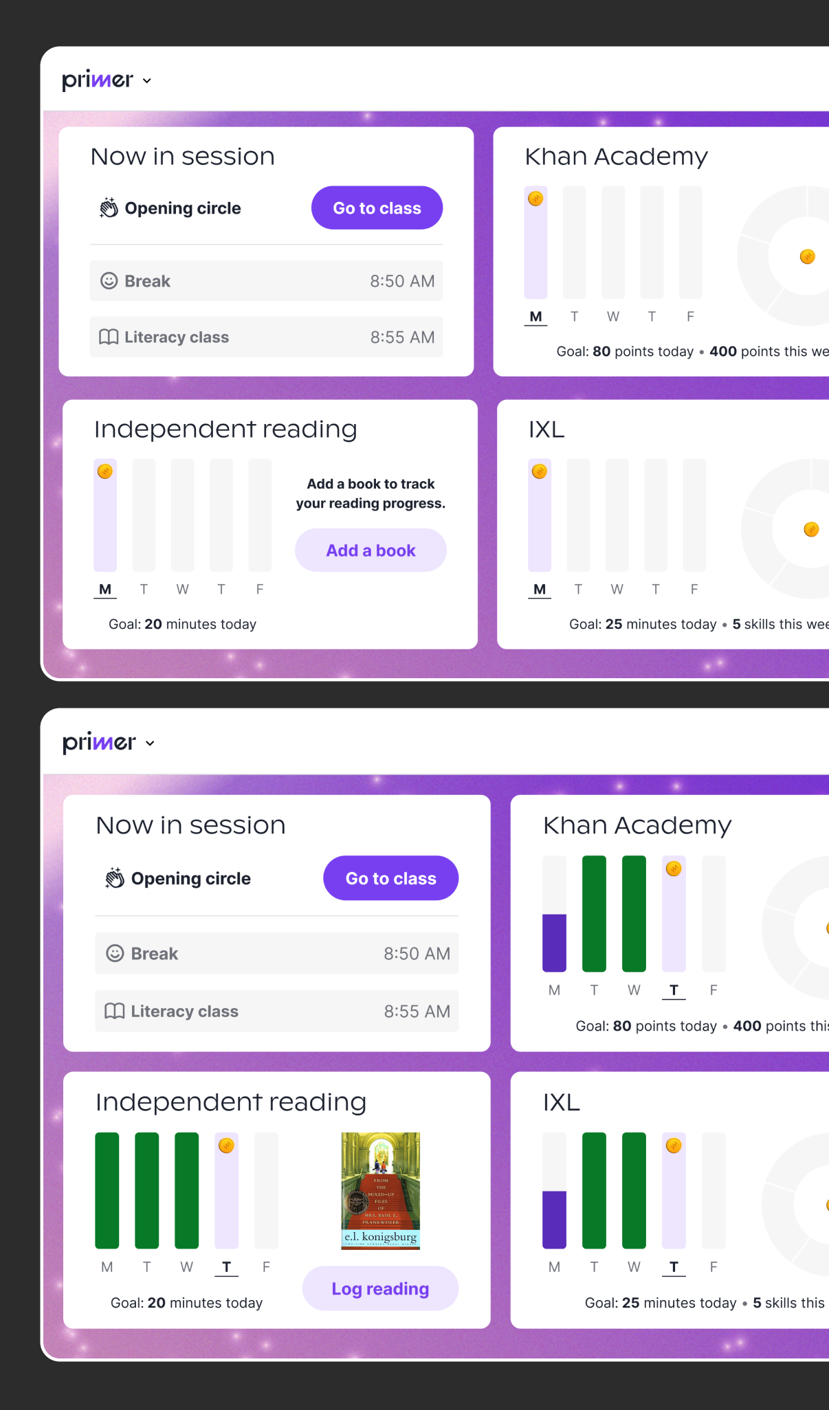
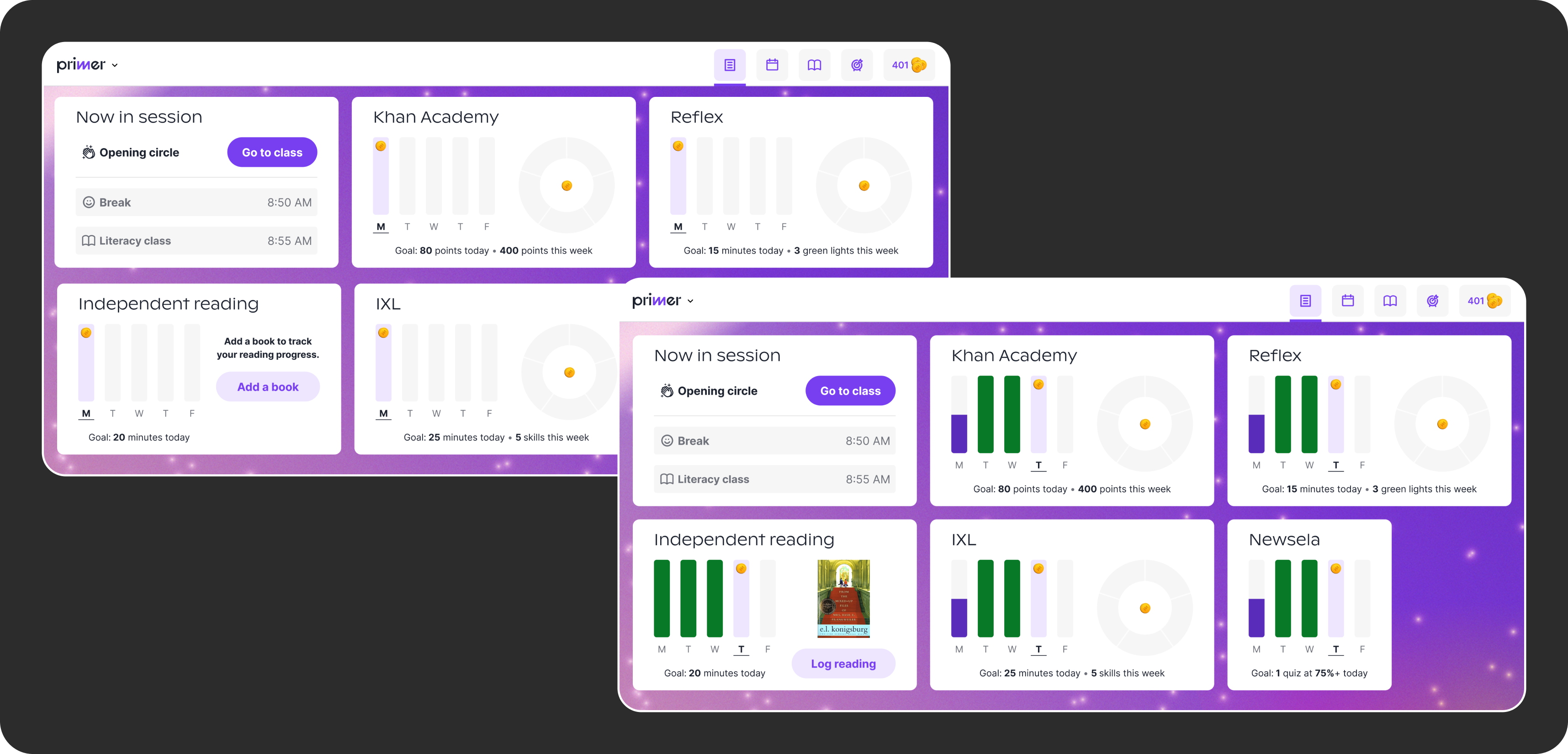
The student experience shows each child's classes with their progress for the day.
Helping students follow their day
The student dashboard was built around the schedule, so students always know which class they're in and what to work on. I helped design the class tiles and their different states, showing whether a class goal has been met or not, so students could see where they stood at a glance.
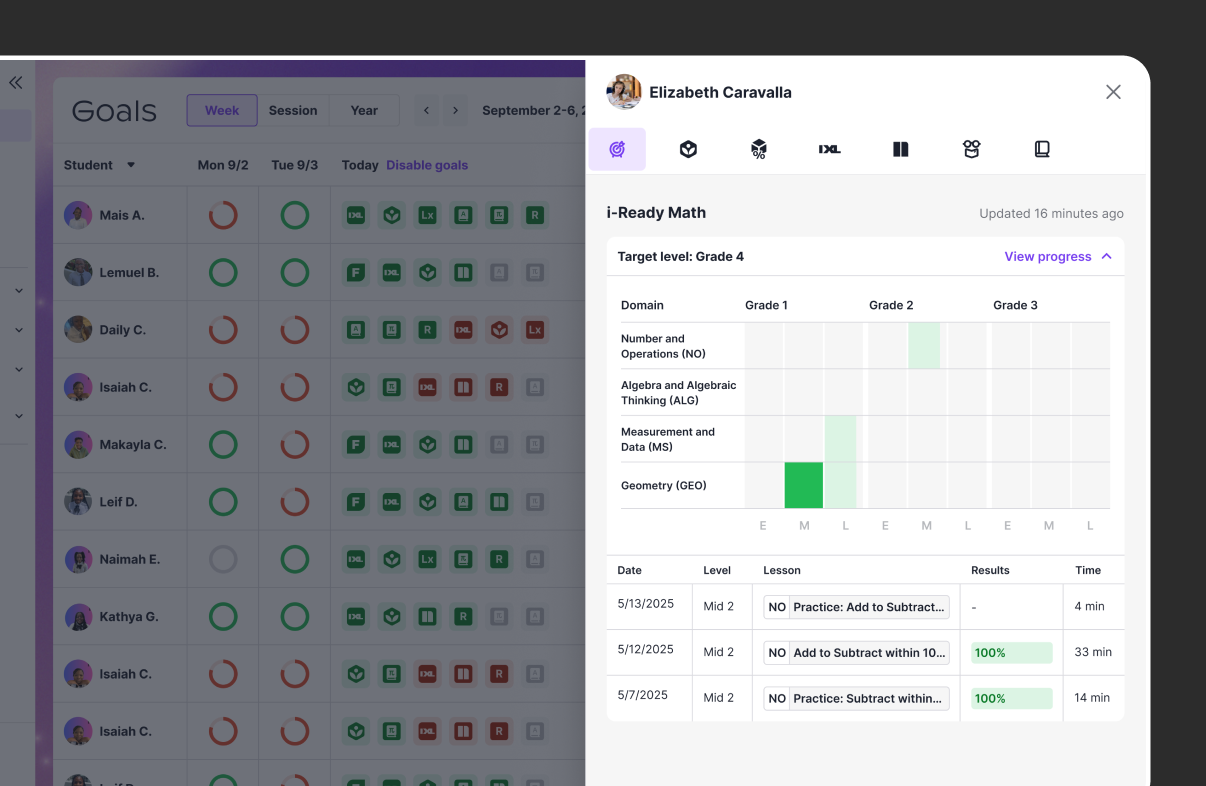
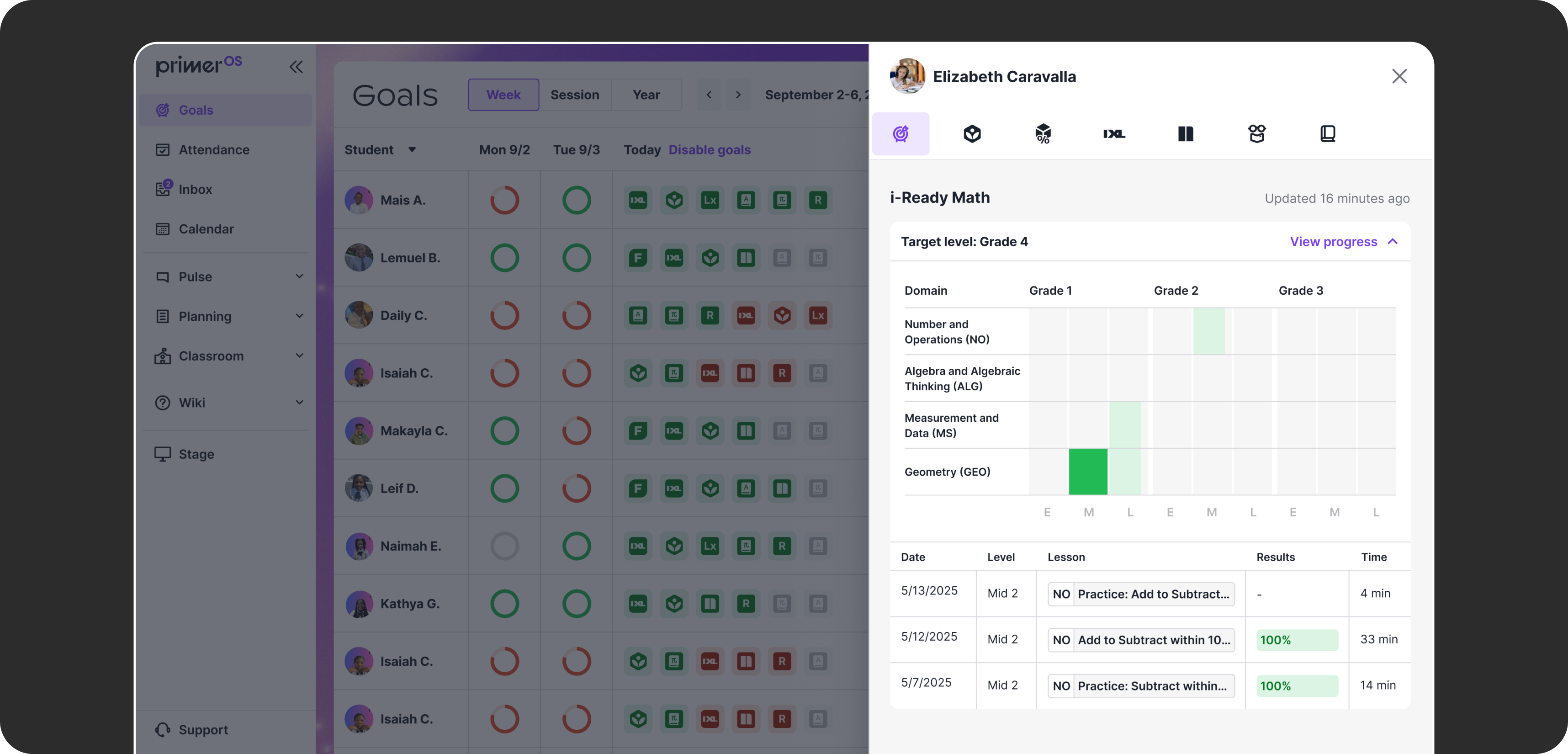
I helped design some of the tables and graphs used in the teacher experience, helping teachers keep track of student progress in various apps.
Tools for teachers
Teachers needed one place to see how students were doing and handle the rest of their day. On the goals dashboard, I helped design the drawers that open with tables showing a student's detailed progress in each learning app, so teachers don't have to open the apps themselves.
I also worked on smaller improvements to the teacher experience. I redesigned attendance to use tags instead of checkboxes, making it faster to mark and easier to see each student's status at a glance, and designed the screens for an improved teacher inbox, including empty states, mark messages unread, and other various states.
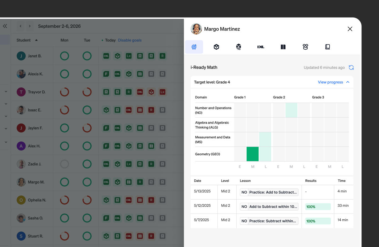
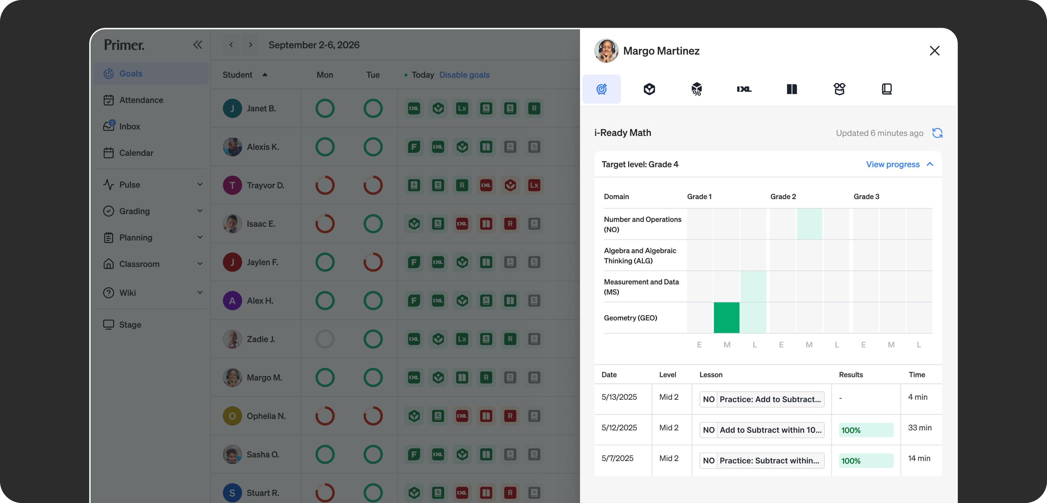
When Primer rebranded, I worked on updating the teacher experience to the new colors, type, and icon suite.
A new design system for a new brand
When Primer rebranded, I worked on the new design system that brought the brand across the platform. I used variables to update colors, typography, and core components, and it helped keep the student, teacher, and parent experiences consistent.
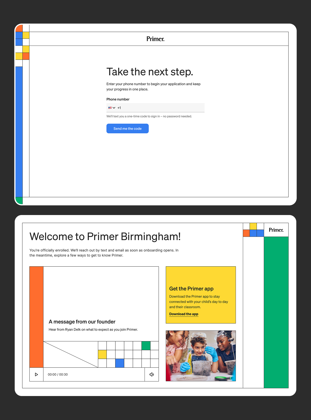
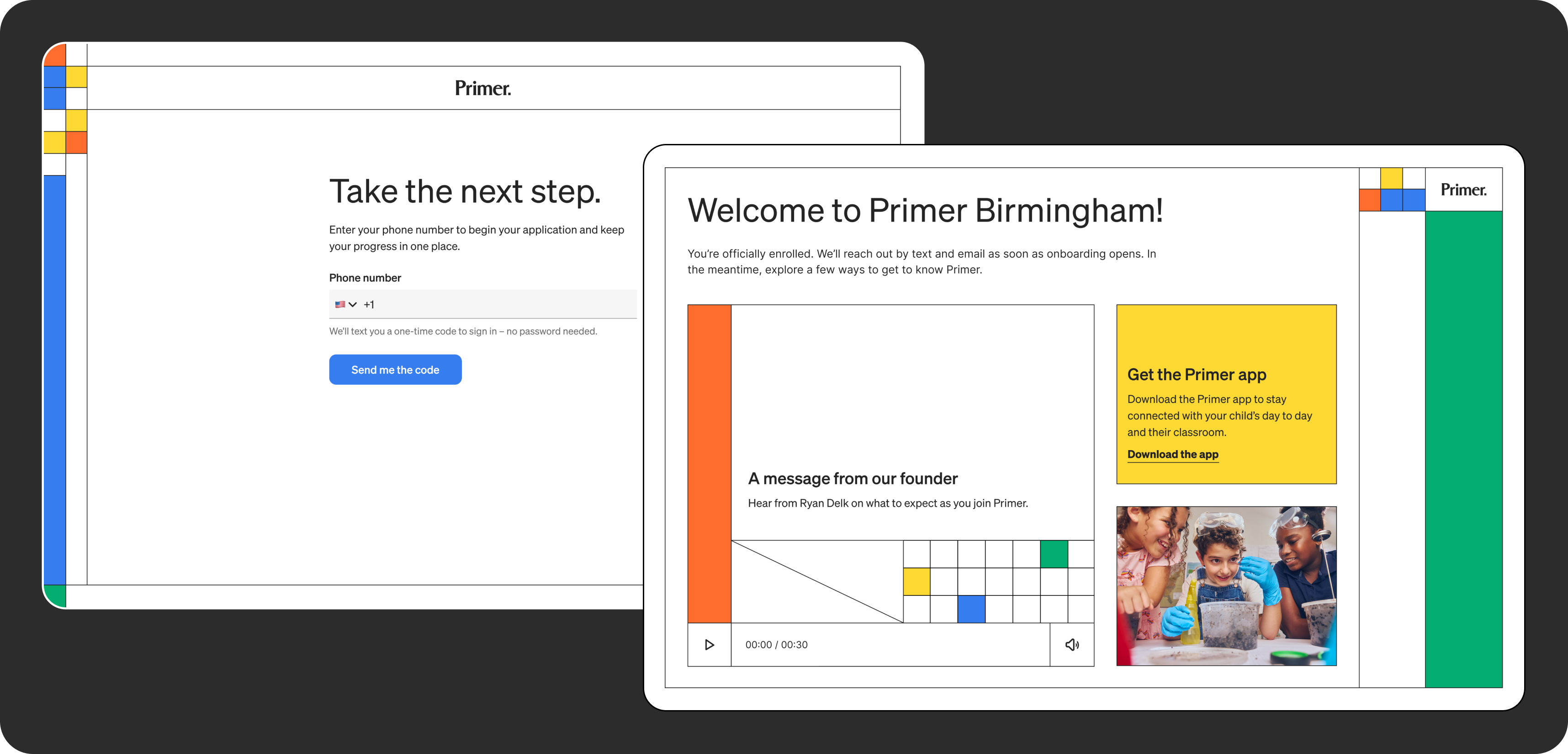
As part of the rebrand, we redesigned the enrollment flow with the new brand, and I led the visual design.
The outcome
Over our partnership, Primer expanded from schools in 2 states to 4, running on one platform for students and teachers instead of a patchwork of outside tools. For the parent side of the platform, check out the Primer App case study.