The ask
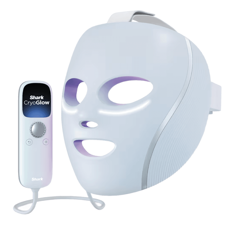
Shark Beauty wanted to enter the skincare space with an LED face mask. The idea was for the mask to have a connected remote that was smarter than their competitors, and didn't require users to download an app. The UI needed to be a fairly simple so that users could still see it with the mask on and lights around their eyes. This created a very unique challenge for us to solve.
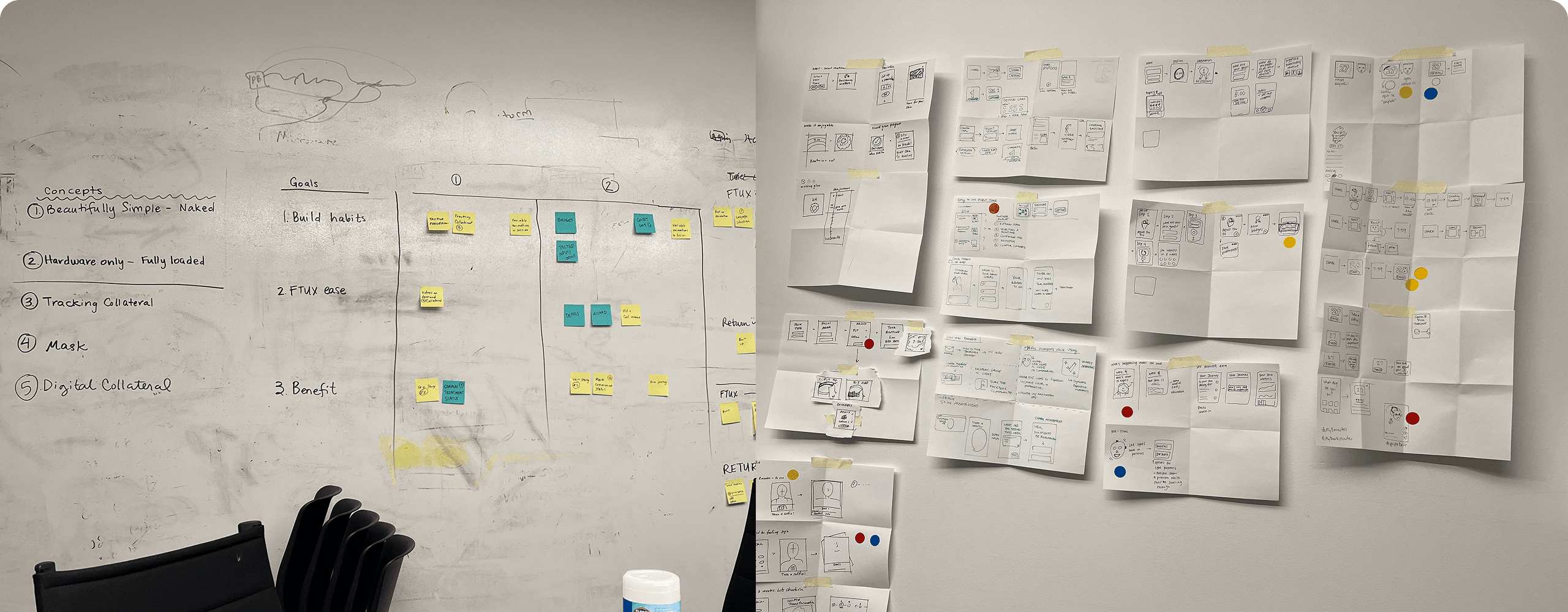
On one of our visits, we worked on brainstorming ideas and did a pin-up and critique to vote for other's ideas we each liked.
Understanding the physical product
We took a trip to the Shark Beauty office in Boston to work with the team in person.
We started by evaluating a demo device, and figuring out the context of use. Operating the remote while wearing a bright LED mask meant very limited visibility and that drove a lot of our design decisions. We needed to ensure that whatever we designed was easy to see and understand with limited visibility and at a smaller scale.
Understanding the functionality of the remote was also an important step. The Shark product team had already decided on using a dial rather than arrow buttons, so we wanted to ensure that users understood how to navigate the UI based on a round control.
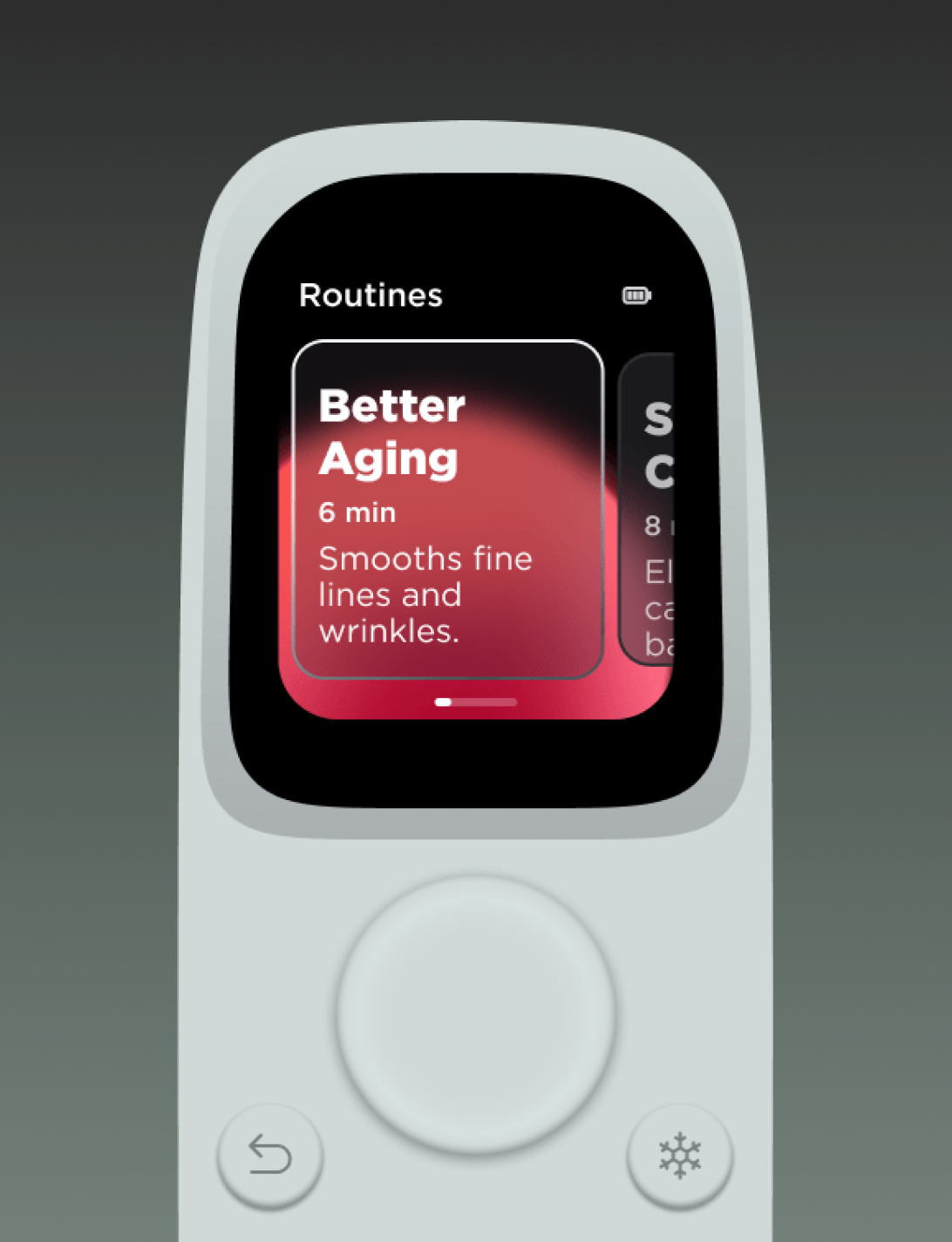
There are multiple routine types the the user can cycle through to find what is best for them.
Our design process
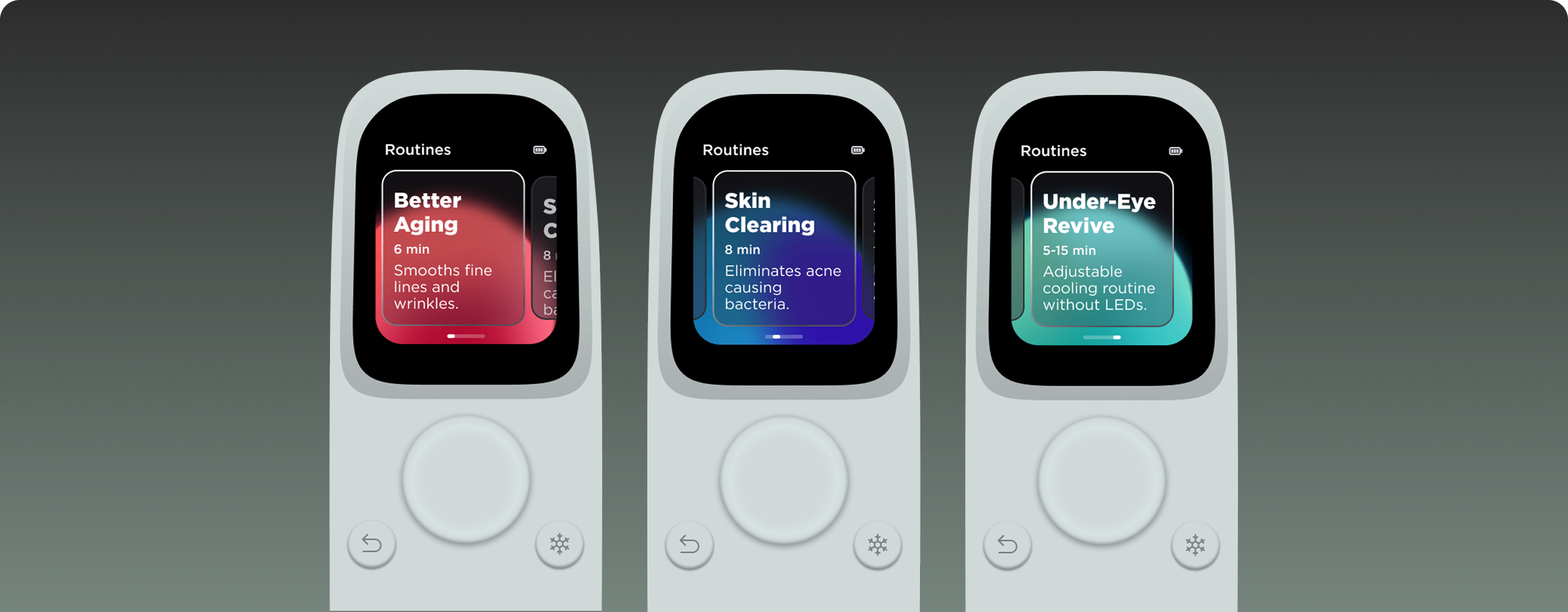
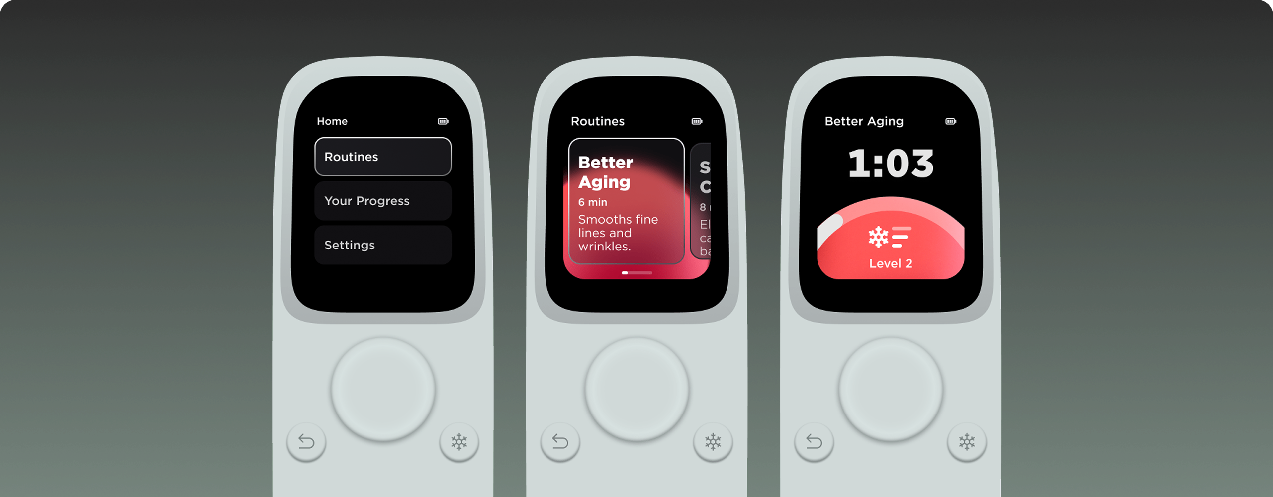
Because the screen on the remote was very small, we implemented large text and simple, high contrast UI elements that could be read clearly and offer best readability.
Because of the round dial control, we decided to show the routine selector as large tiles in a horizontal layout. That allowed us to have plenty of room on the screen to communicate the information that was necessary for users to know without feeling overwhelmed. The naming convention of "routines" along with the written collateral was a subtle way for us to allow users to understand that this is something they will need to do for multiple weeks in order to see results.
Our team chose to lean into the "light" idea and chose to use colors that would reflect which LEDs would be in use during each routine - red light, blue light, a mixture, or only under eye cooling. We also wanted to make sure that whatever we decided on felt like a premium experience, like having the expensive beauty spa treatment available at home. There were multiple designers between our team and the Shark team, so we each took a shot at designs with this idea in mind and met periodically to critique and decide on ideas to push forward.
In the end, the design chosen was the one I had worked the most on. Originally, the idea was for the orbs to move around under the glass panel as the user was scrolling through the routine types, but for visual simplicity, we decided to have them sit in the same place but change gradient colors.
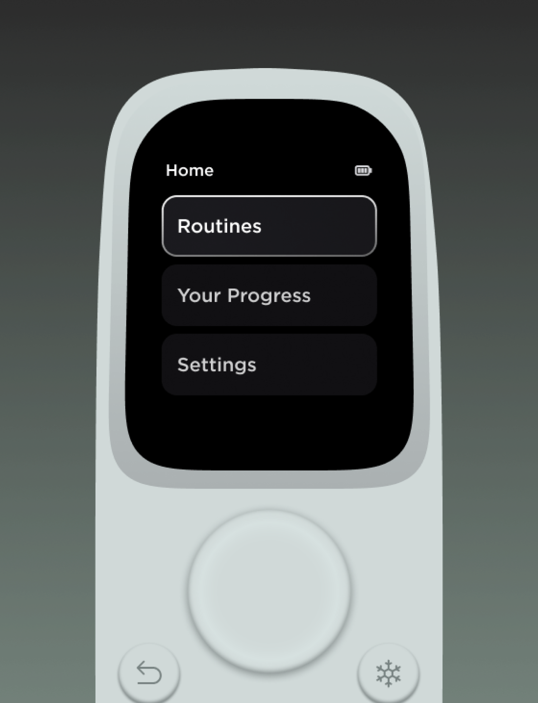
The flow of starting a Better Aging routine starting at Home and ending with the session in progress.
Our process cont.
In order to make the connection between the routine selection screen and the in progress screen, we included the same gradient on the in progress screen. The most important information to include on that screen was the timer, so we used a simple timeline and a large countdown. Users could also add under-eye cooling during any LED routine, so we needed to show the cooling level that was set during the routine.
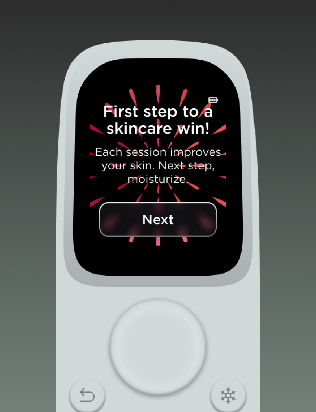
Rewards and progress tracking to encourage consistent use.
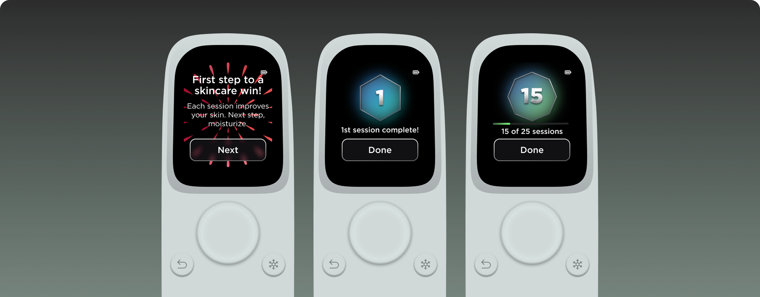
Encouraging consistent use
Consistent use of light therapy is the best way to see results, so to encourage users to stick to a regular routine, we included celebratory screens at the end of each session as well as badges for users to collect and view over time. Trying to encourage habit formation could help users stick to a routine and see results.
We worked on this part during one of our visits to brainstorm in person. I worked on drawing these badges to make each one slightly different, encouraging users to want to collect more.
My learnings
This project was a very interesting and challenging problem to solve. Collaborating with the Shark team was really fun, and their drive for innovation was so inspiring. I really enjoyed our brainstorms and visits to their office. We went through so many iterations of this UI and pushing and pushing stretched me so much, but I am so happy with how it turned out in the end.