Product Design
Alloy
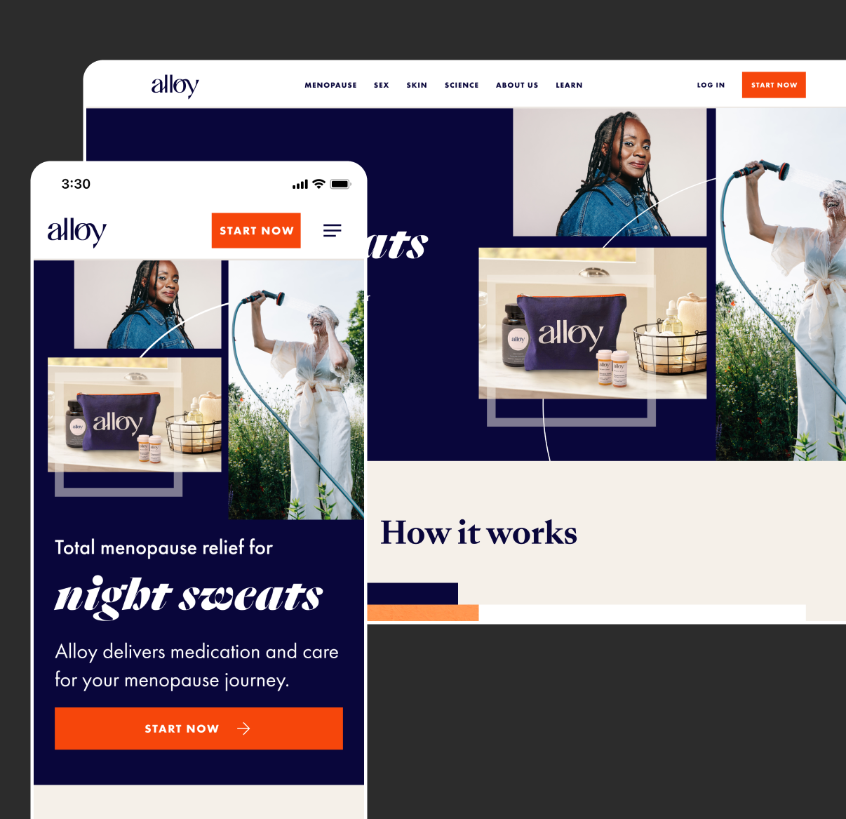
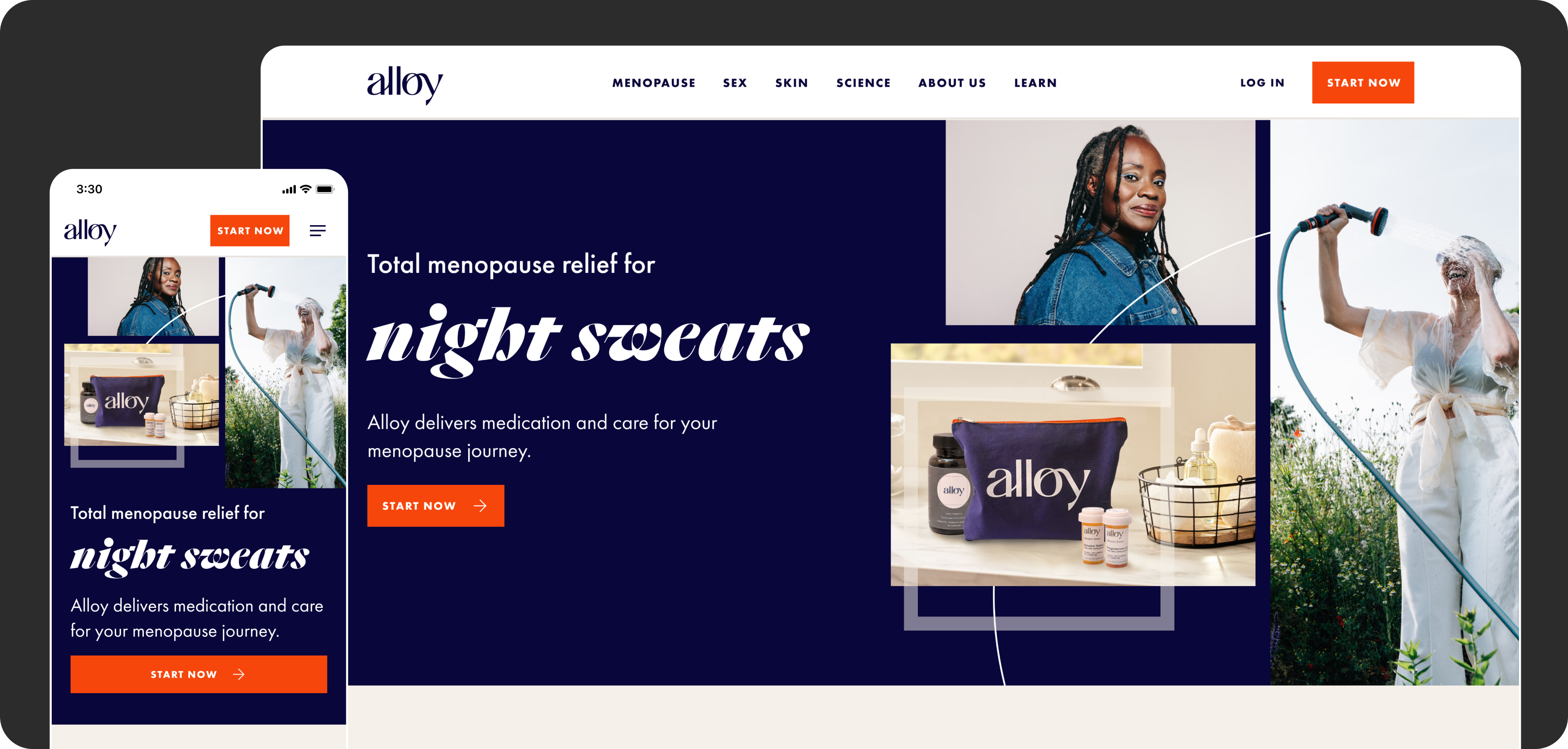
As Alloy Health expanded beyond menopause care into skincare, weight loss, and gut health, I worked with Alloy to redesign the full patient experience, from the marketing site and product pages to the intake flow and patient accounts, while rolling out their bold new brand. The redesign doubled Alloy's conversion rate.
The problem
Alloy offered telehealth visits to make menopause medication more accessible. But as the company added new categories, the original site became hard to navigate. Patients couldn't easily see what Alloy offered or how to get started, and many were messaging doctors just to ask which treatments existed. That slowed down care for patients and took time away from actual treatment.
At the same time, Alloy rebranded. The new brand was bold and bright, built to challenge the idea that women going through menopause should be quiet about it or hide what they're experiencing. The site needed to carry that confidence while making care easier to reach.
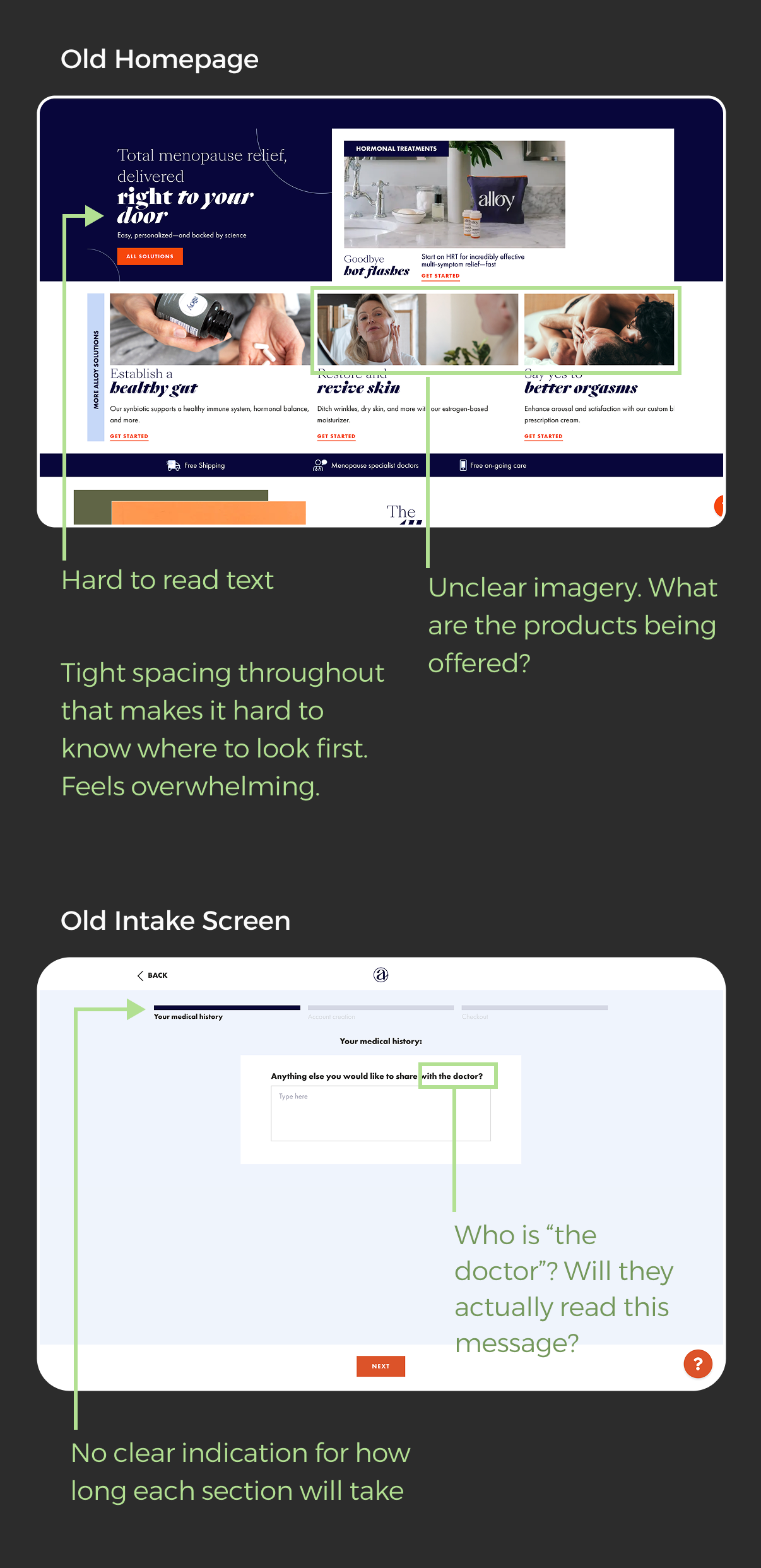
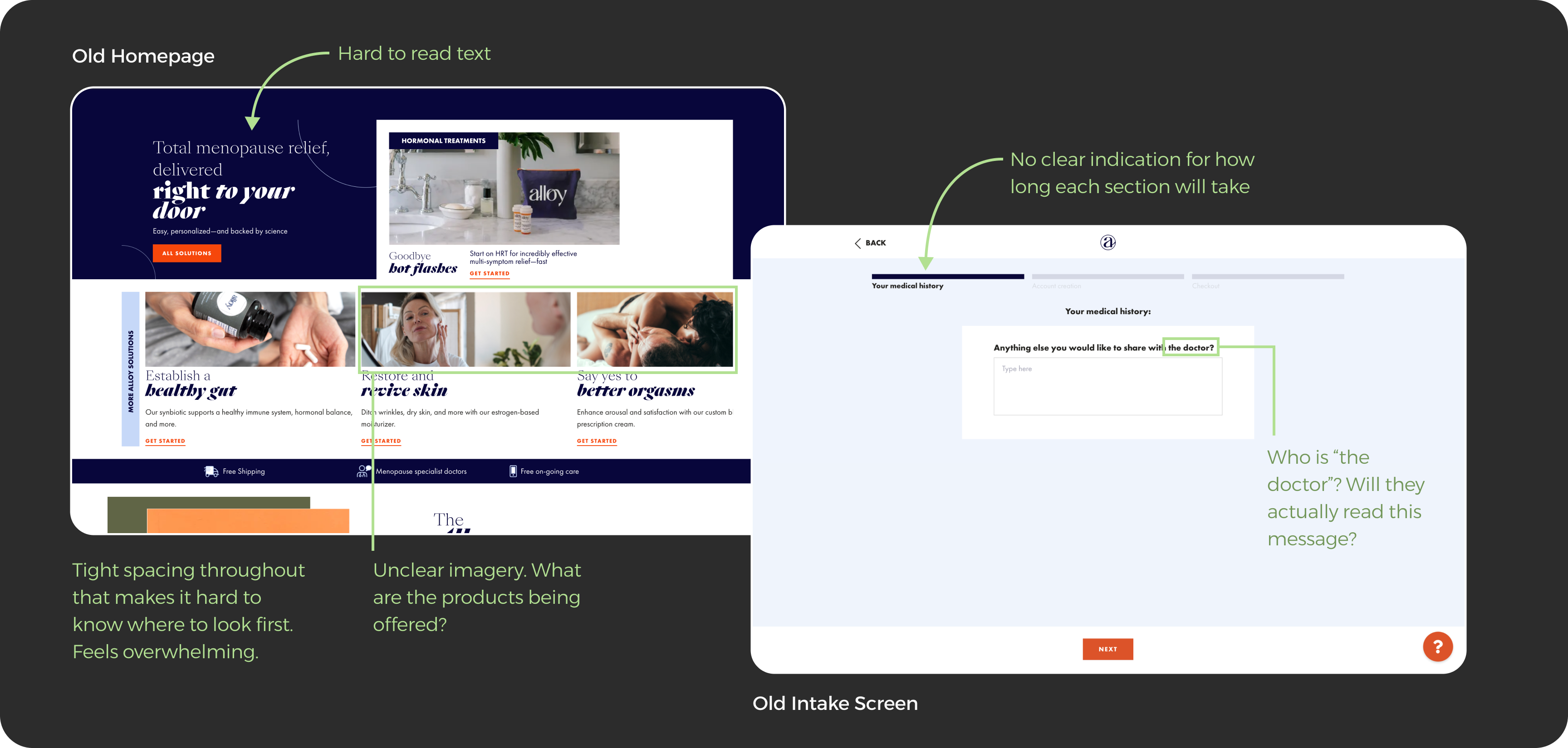
The old site had a few clear problems that we knew would help users better understand the offering and the process.
What we learned
We took the problems that Alloy knew users were experiencing in their original intake flow, and made updates. Then, we did usability testing with the slightly updated flow to hear directly from users.
Two problems stood out:
- Patients didn't realize most treatments required a prescription. They expected to browse and buy like a typical store, and were caught off guard by the intake flow.
- Patients didn't realize they'd be working with a real doctor. Alloy's biggest differentiator, access to doctors who specialize in menopause, was getting lost.
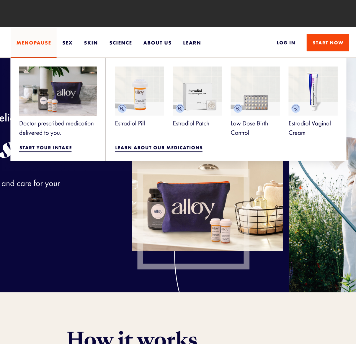
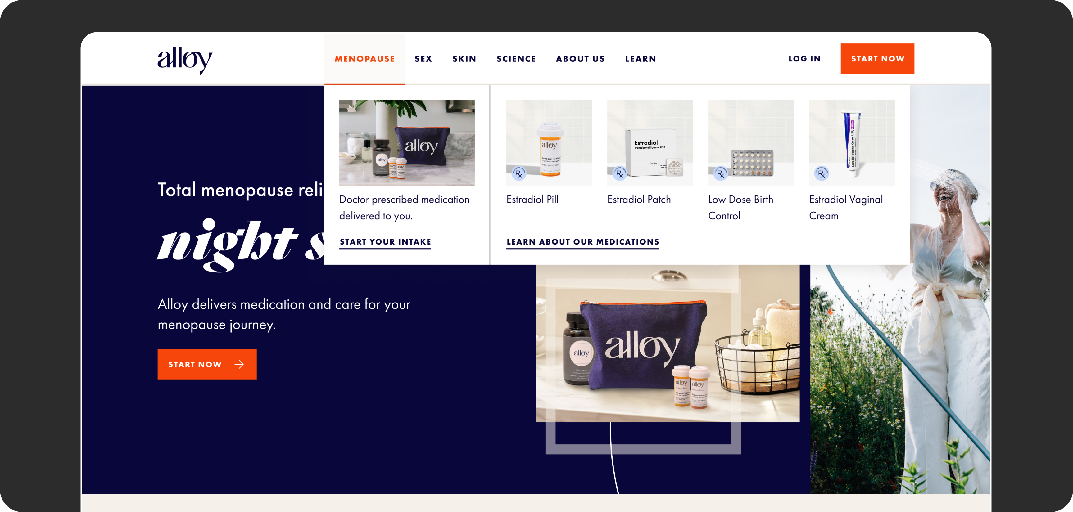
Updating the images to show actual products helped users better understand what the offering was.
Making treatments easy to understand
We redesigned the site around education and the product offering, so patients could easily learn what was available. The site was originally using more generic lifestyle images for product shots, so it was hard to understand what the actual products looked like.
I recreated the product photography as a consistent set of mockups showing each product, so patients could compare treatments side by side. Each one clearly flagged whether it required a prescription, so the intake flow felt expected instead of surprising.
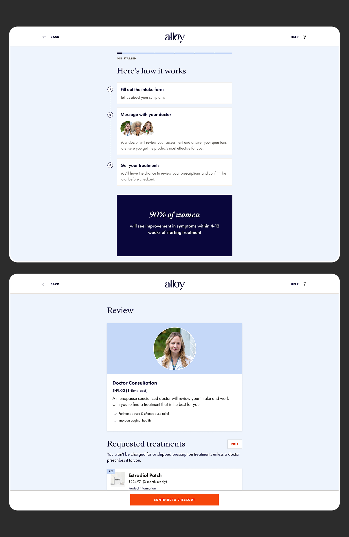
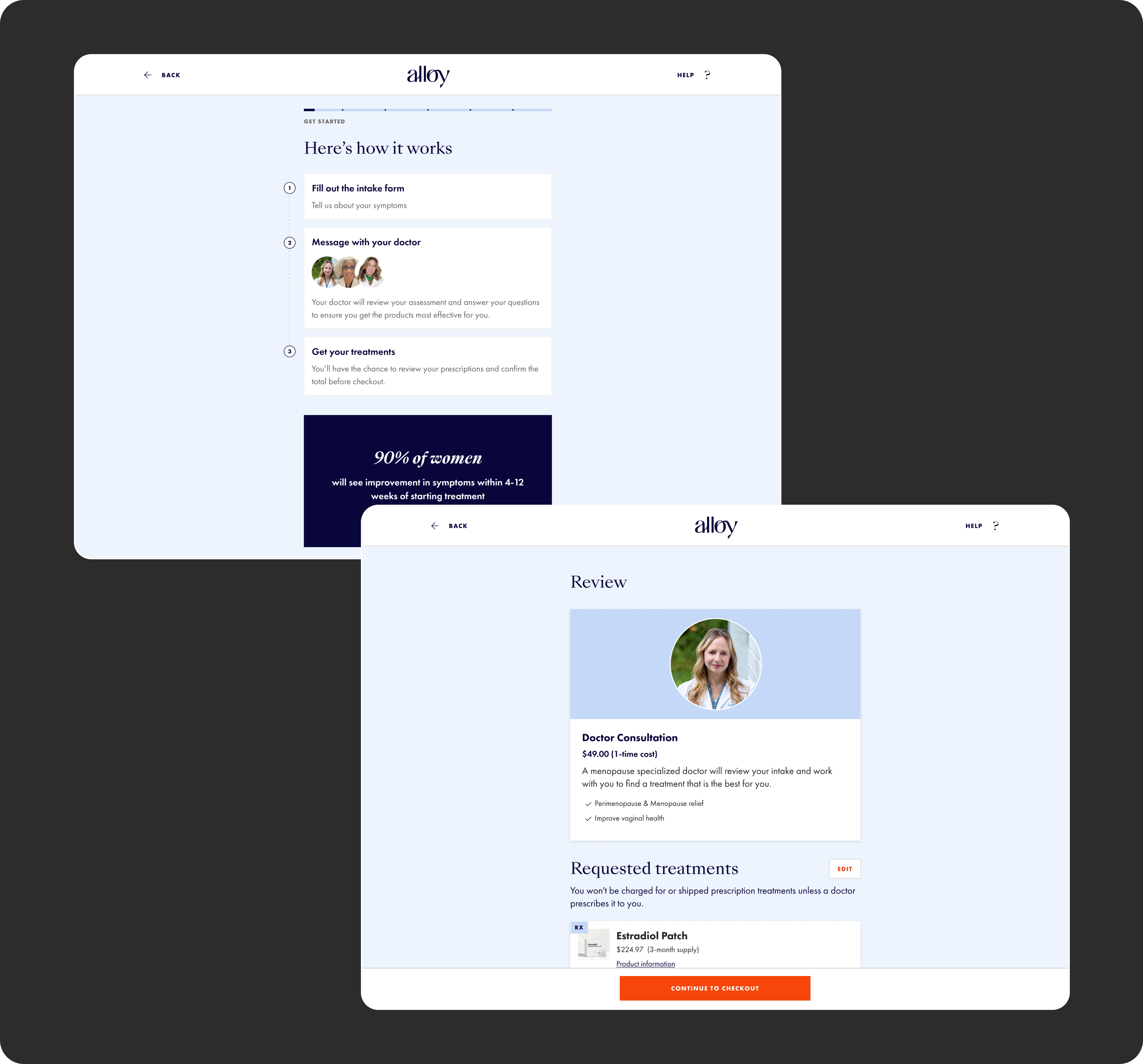
Including a "how it works" step in the intake flow reinforced the easy process and adding a review step reinforced the doctor, and that they would be reviewing the intake to prescribe a treatment.
Putting the doctor front and center
To make Alloy's real advantage clear, we emphasized the doctor's role throughout the site and intake flow, from the "How it works" section to the overview showing a real doctor's image and the user's selected treatments. Patients knew from the start that a menopause specialist would review their information and create their treatment plan.
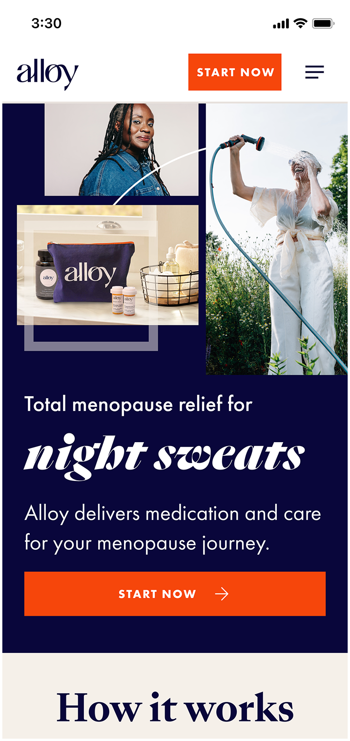
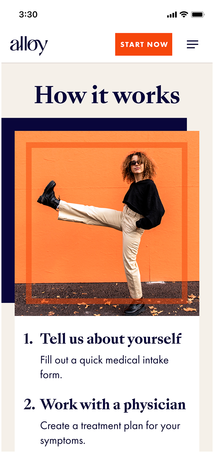
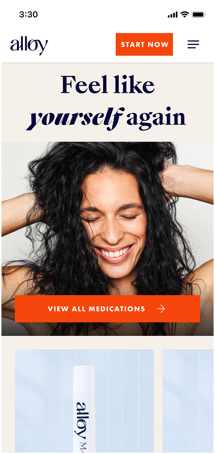

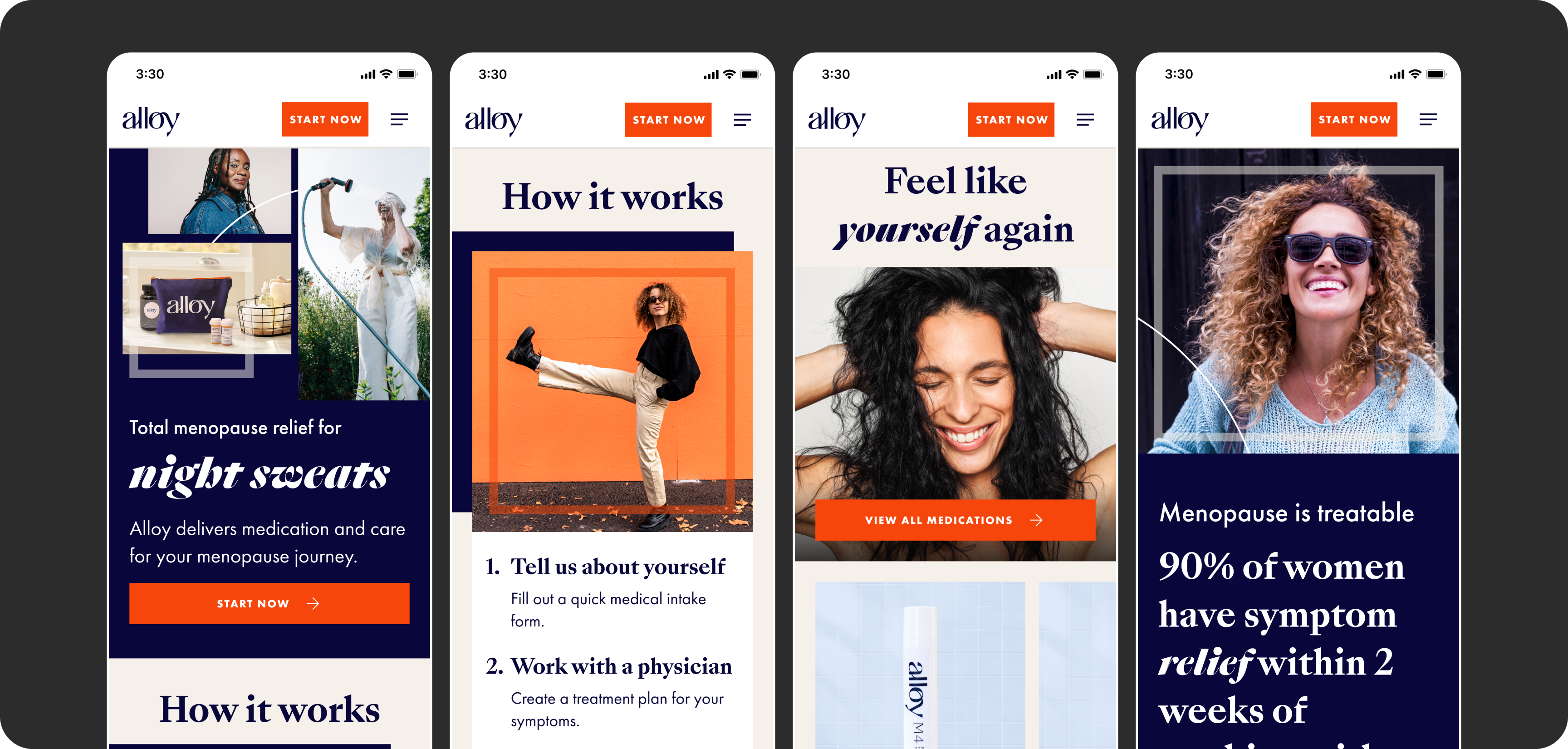
I extended the brand across the site, using images of strong capable women. NOT "old" women!
Bringing the new brand to life
I applied the new brand across the site, using its bold type, bright colors, and confident photography to make the experience feel empowering rather than clinical. Every page was designed responsively, so that patients that visited on mobile also had a positive experience.
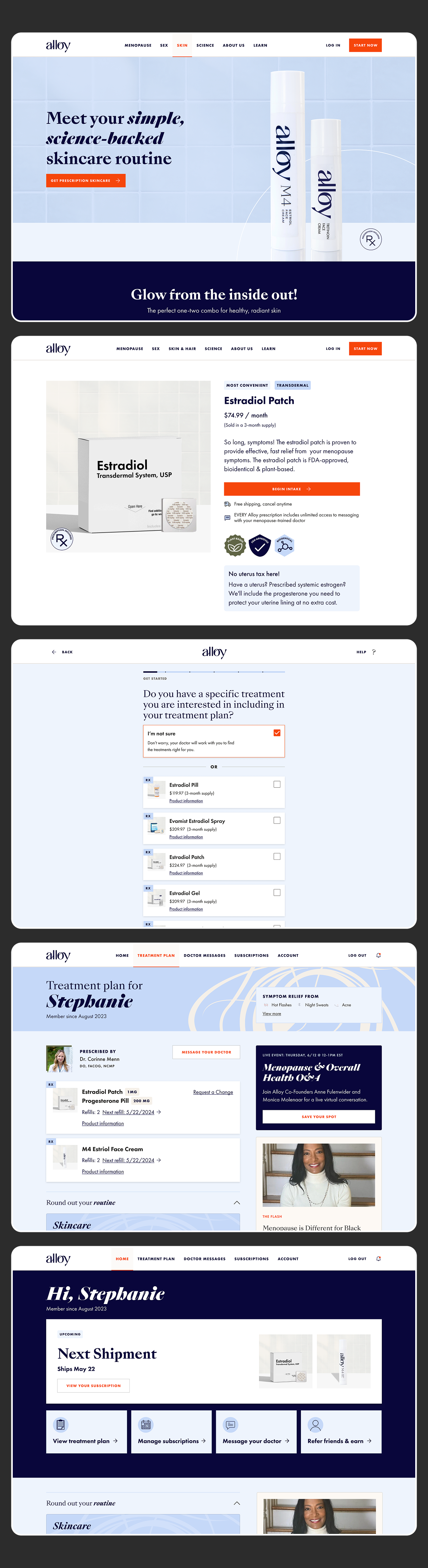
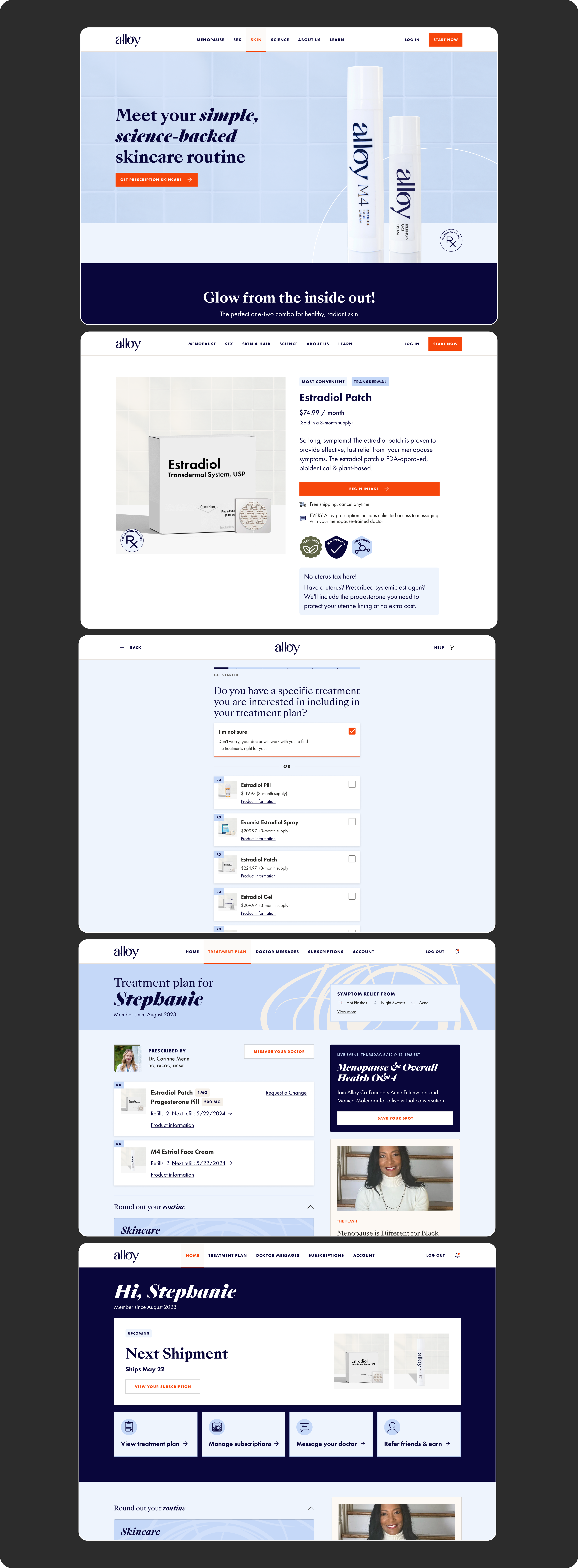
I touched every page of the site over 2 years, from new products, to events, account, and product pages.
Designing the full patient journey
The redesign didn't stop at the homepage. Over 2 years, we redesigned every stage of the patient experience so it felt like one connected journey:
- I updated every marketing and product detail page with the new brand, keeping treatment information clear and consistent as Alloy added new categories.
- We redesigned the intake flow so patients knew what to expect at each step, with progress indicators and plain-language questions, and could see that a menopause specialist would review their answers.
- After signing up, patients needed to manage their treatments, track orders, and message their doctor. We redesigned the account pages so ongoing care felt as clear and supportive as getting started.
Because the same team designed every stage, patients saw the same language, visual style, and focus on their doctor. As Alloy launched new products, we extended the system to cover them.
The results
The redesign doubled Alloy's conversion rate, and patients spent less time messaging doctors with basic questions.