Product Design
Primer App
Primer's microschools depend on close communication between teachers and families, but that communication was scattered across a web inbox, email, and personal text messages. As part of a partnership with Primer's in-house team, I helped design a dedicated mobile app that brought announcements, messages, and school updates into one place, so parents stayed in the loop.
The problem
Parents needed one reliable place to follow their child's progress, see school announcements, and reach teachers. Primer's existing web product had an inbox and an activity feed, but it wasn't built for mobile and couldn't send push notifications.
So communication drifted elsewhere. Important updates went out by email and got buried, and parents weren't really keeping up with or understanding their child's day-to-day. Parents missed messages, and weren't able to stay easily engaged with their child's school day.
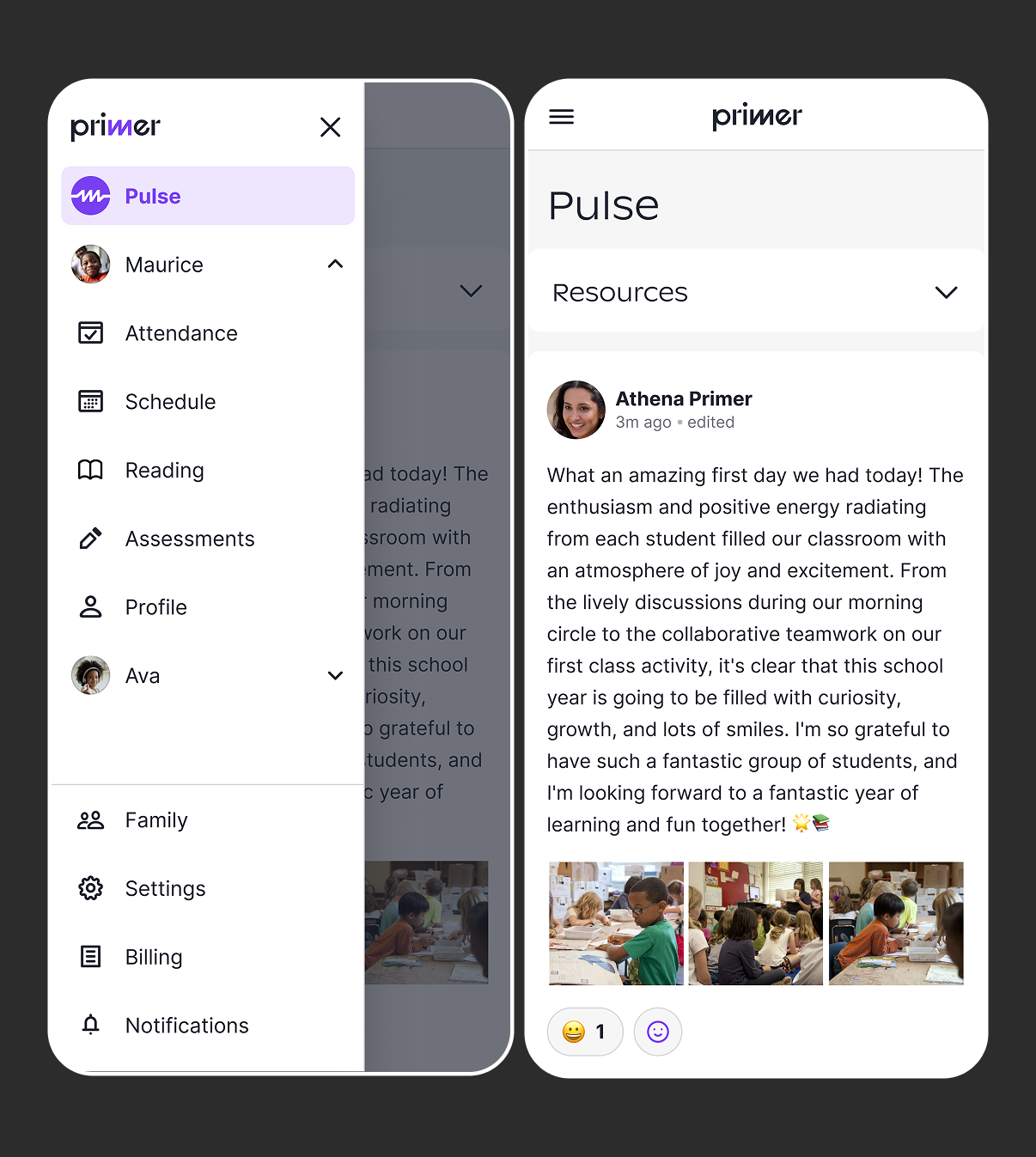
The mobile web version of the site had too many navigation options, especially for families with multiple children, making it hard to know exactly where to find certain things. Important info about the school was hidden under the "Resources" drawer at the top of the Pulse feed.
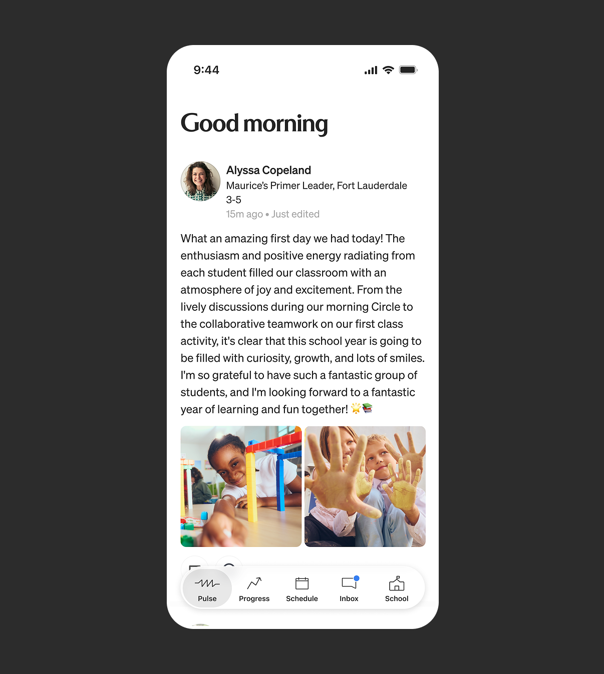
The app allows for a simpler navigation, that works even with multiple children. Each tab is dedicated to the most important info that parents need.
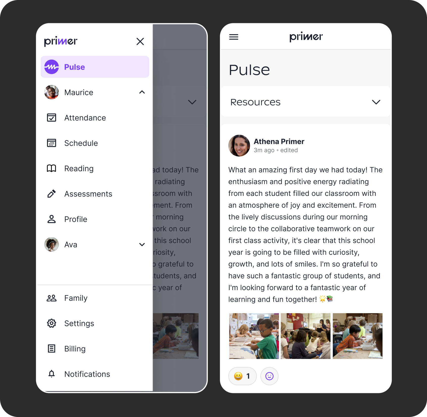
The mobile web version of the site had too many navigation options, especially for families with multiple children, making it hard to know exactly where to find certain things. Important info about the school was hidden under the "Resources" drawer at the top of the Pulse feed.
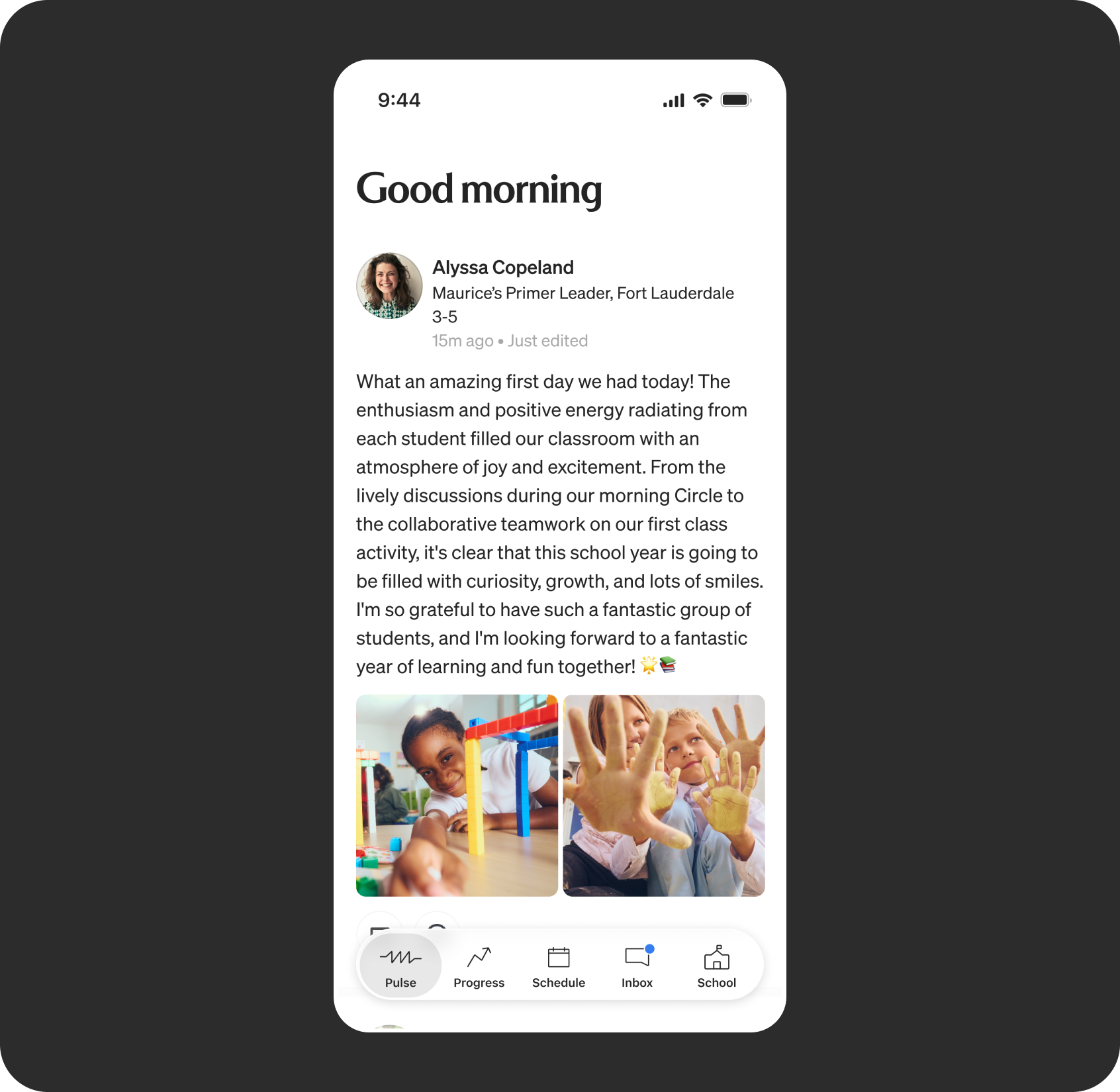
The app allows for a simpler navigation, that works even with multiple children. Each tab is dedicated to the most important info that parents need.
Designing for busy parents
Parents check school updates in quick moments throughout the day, so the app needed to make the most important information visible in seconds, without parents digging through menus or wondering if they'd missed something.
That meant removing the friction they were experiencing by using the website on mobile: push notifications instead of email links, staying signed in, and a simple tab bar navigation.
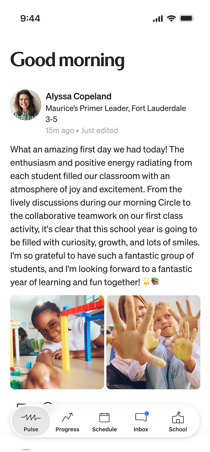
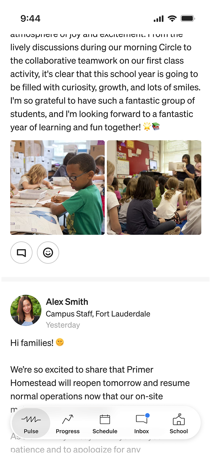
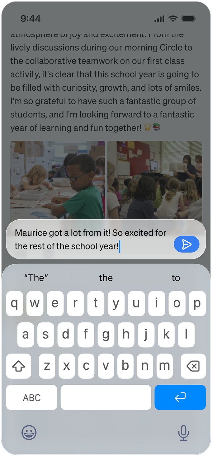
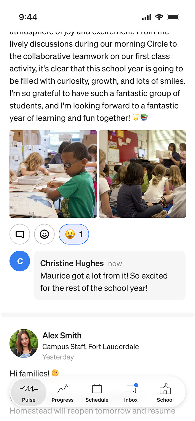
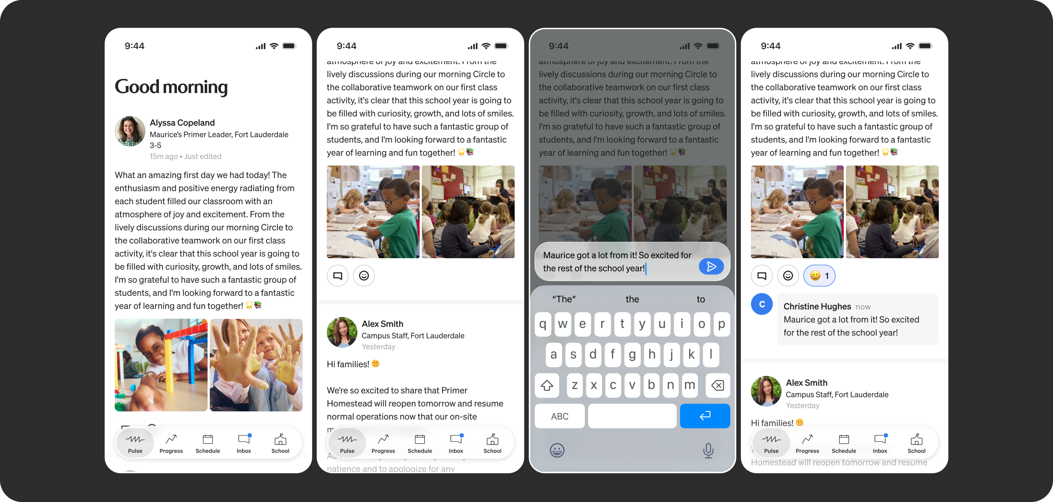
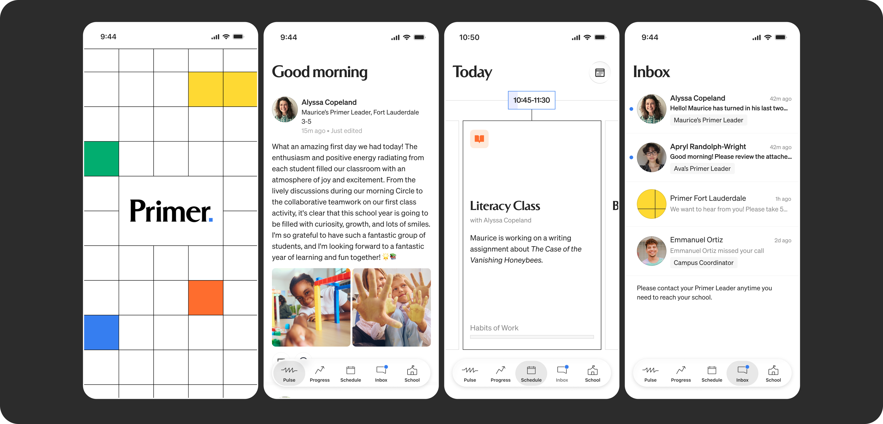
Parents can directly comment and react to posts in the Pulse feed, allowing for more engagement with their child's education.
A home feed for the school day
The home screen opens to Pulse, Primer's classroom news feed, where teachers share announcements, updates, and photos from the classroom. Pulse had already replaced teachers' group email blasts on the web, but without notifications, posts were easy to miss.
In the app, push notifications meant parents saw posts as soon as they went up. We also made posts more interactive, so parents could comment, react with emoji, and save photos to their phone.
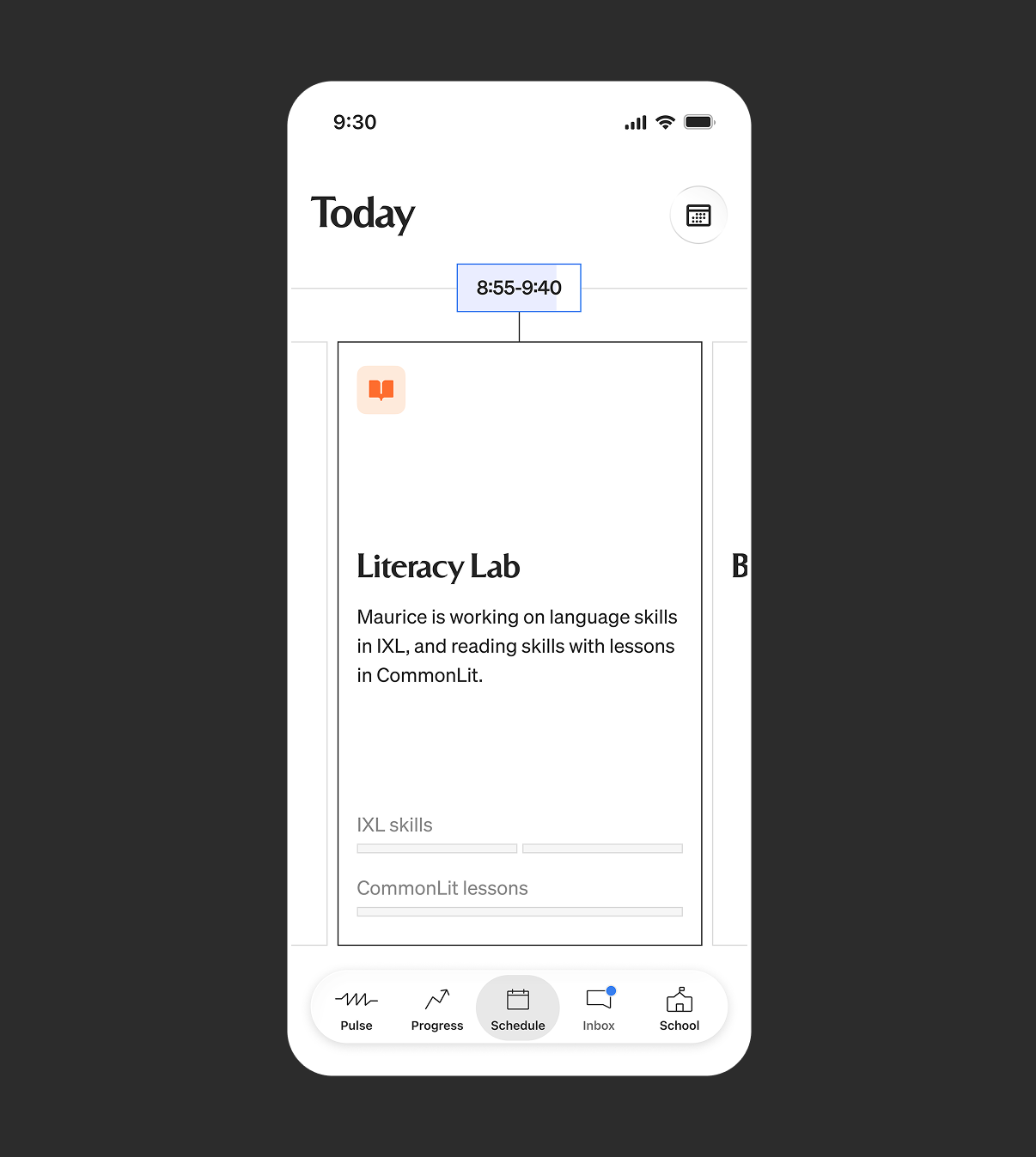
View of a current class in the schedule.
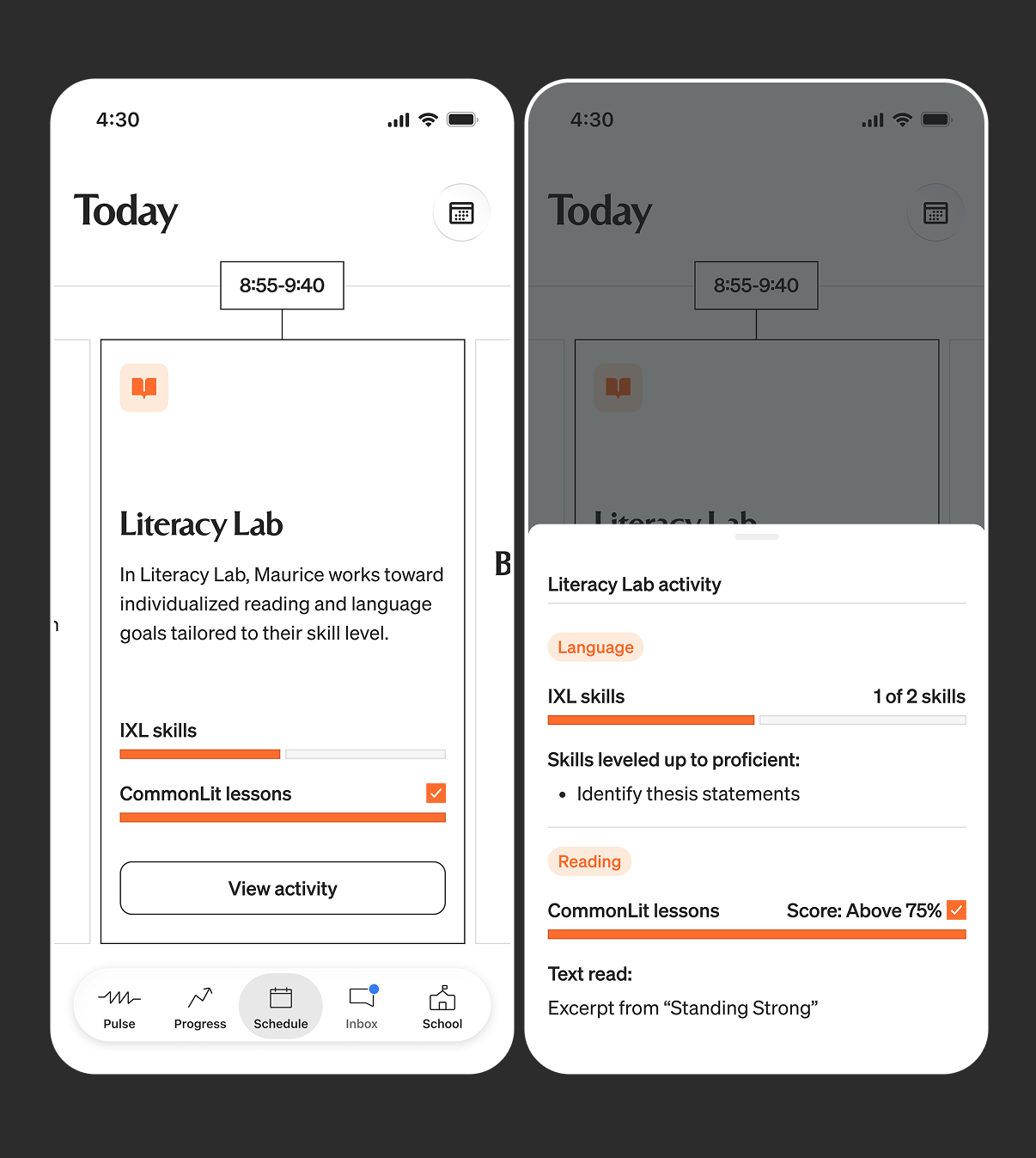
Once the class is finished, parents can go back and view their child's progress for that day, and see specific details for what they were working on in class.
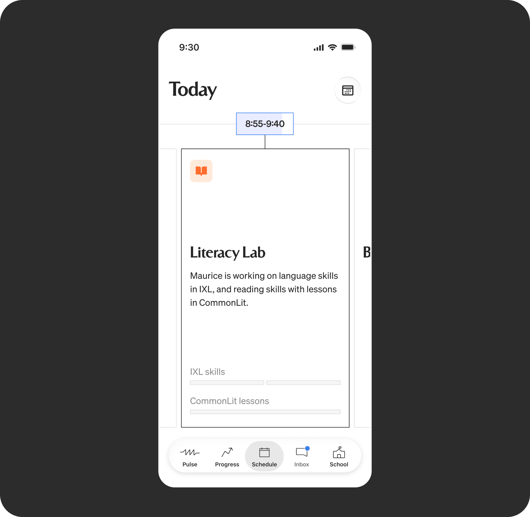
View of a current class in the schedule.
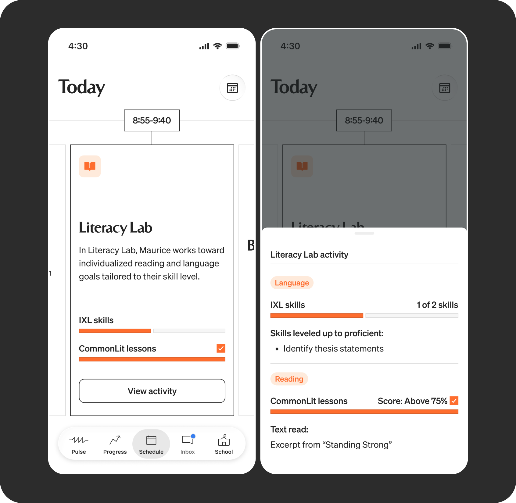
Once the class is finished, parents can go back and view their child's progress for that day, and see specific details for what they were working on in class.
Seeing their child's day
The schedule shows parents more than a static list of classes. Each class appears as a card that advances as the day goes on, so parents see what their child is in right now, can swipe back to earlier classes, and can tap in to see what their child is working on and has finished.
Special days got their own states, including holidays, field trips, and standardized testing. Field trips, for example, tell parents what to send, like a packed lunch or specific clothing.
The day ends with a wrap-up showing how many goals their child met, with a weekly version for parents who don't check daily.
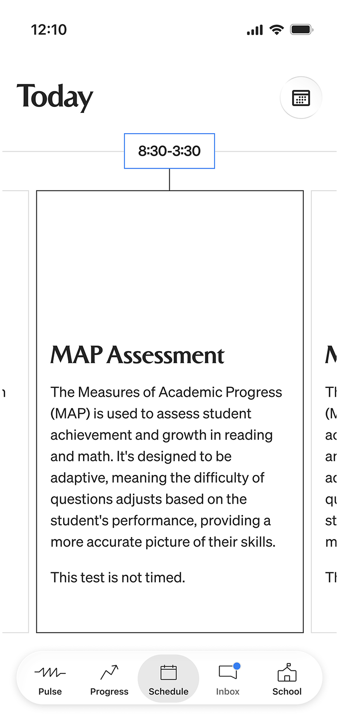
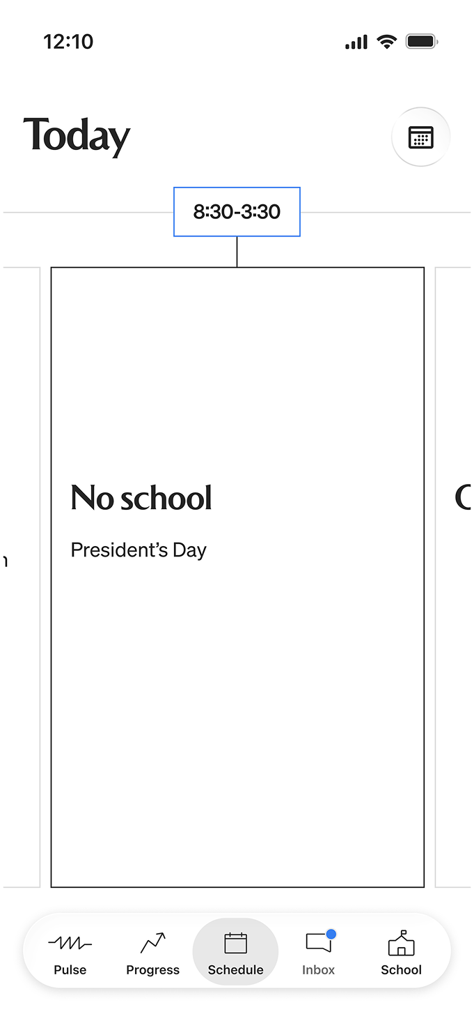
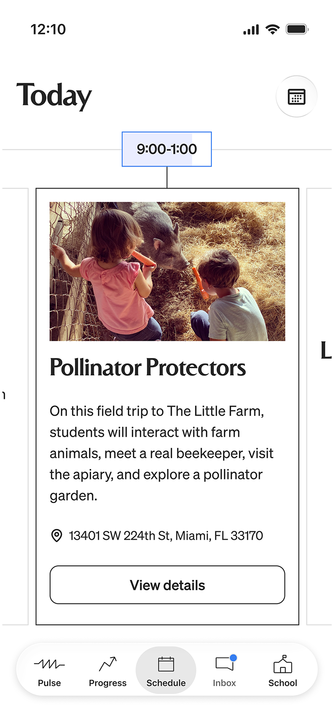
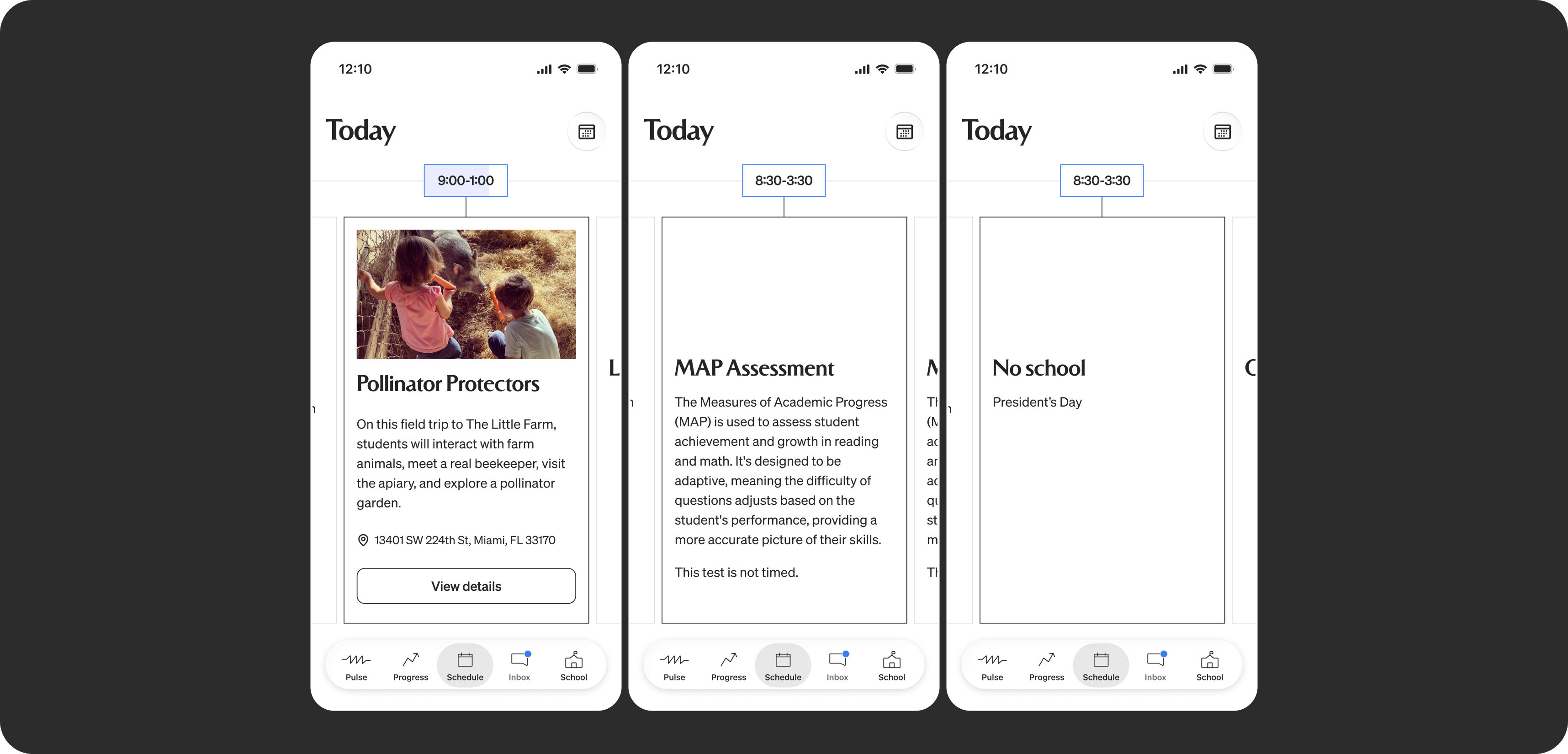
Special days have their own schedule states.
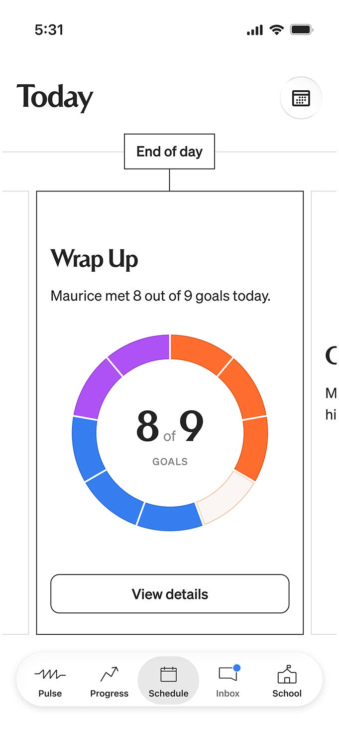
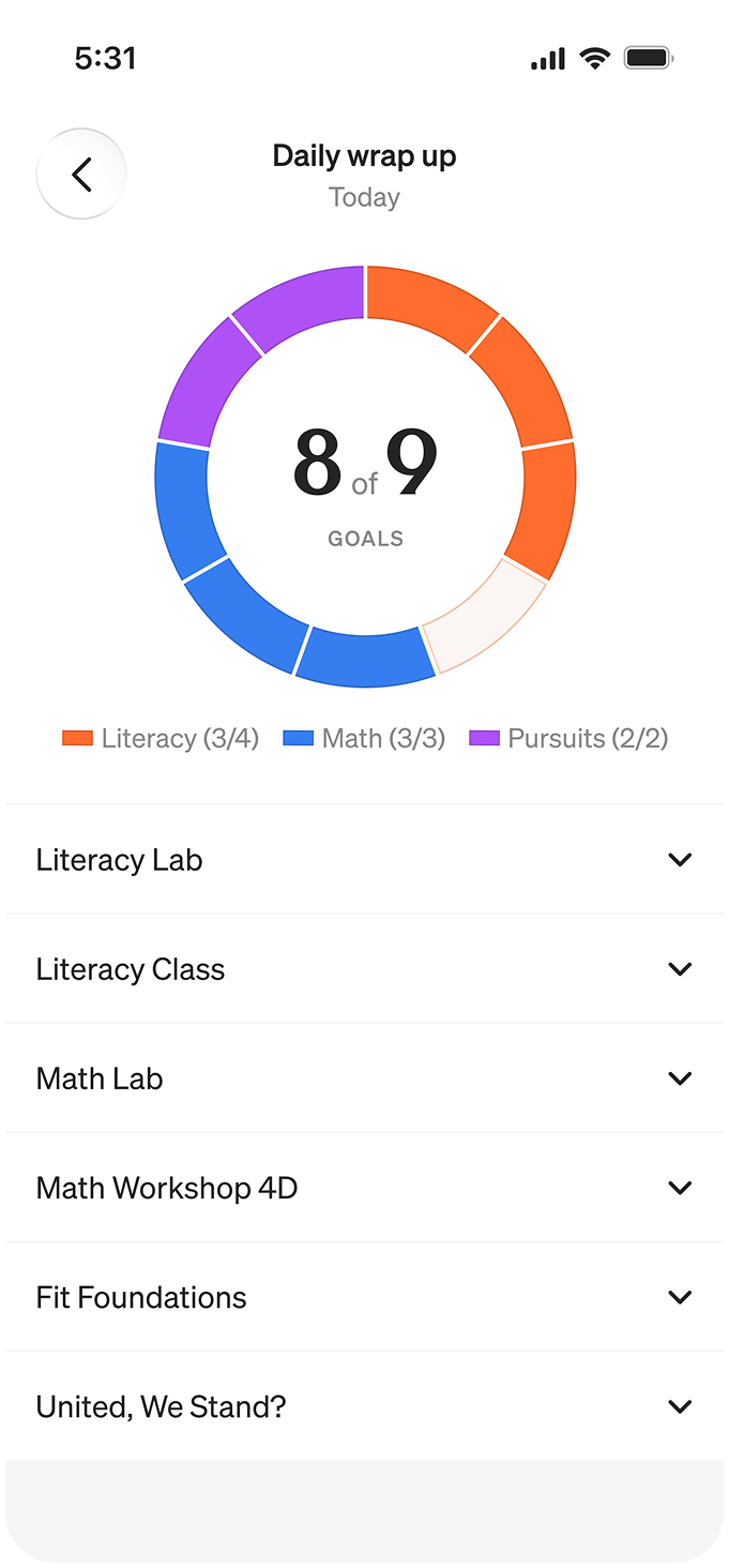
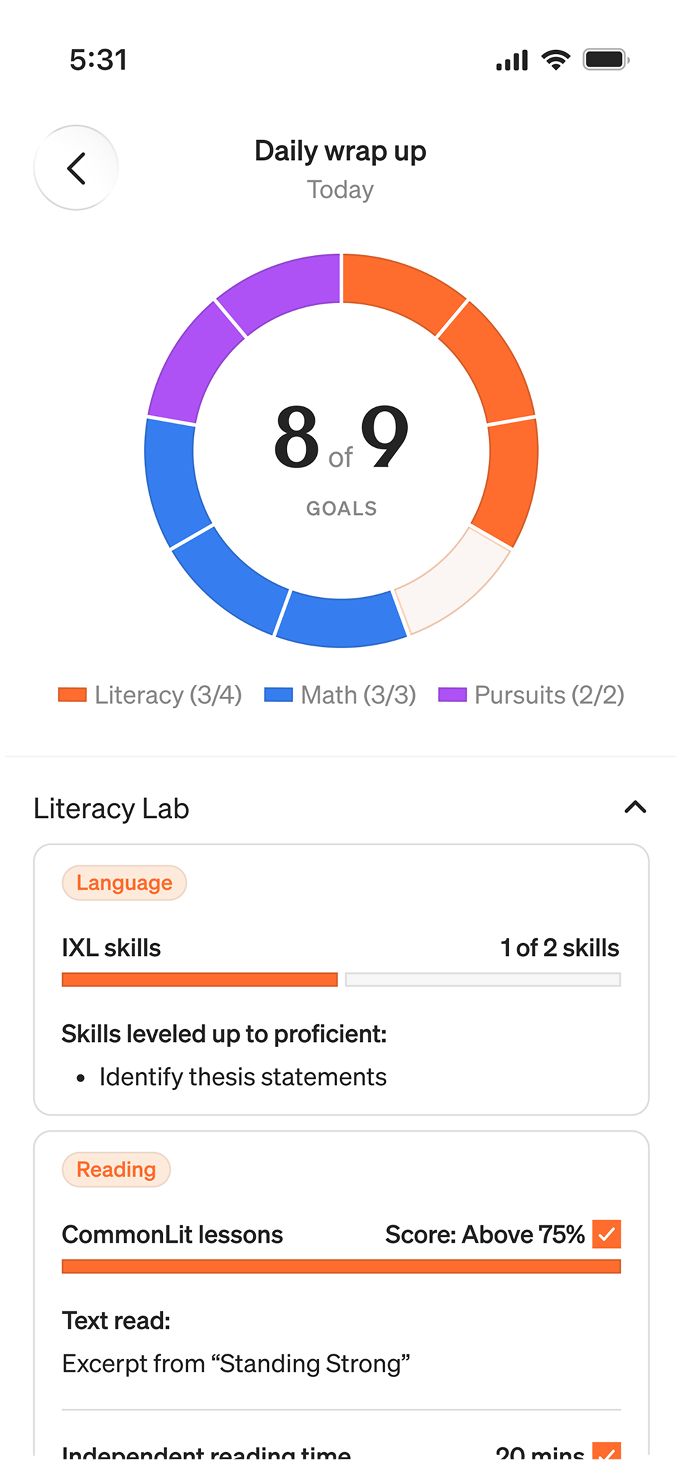
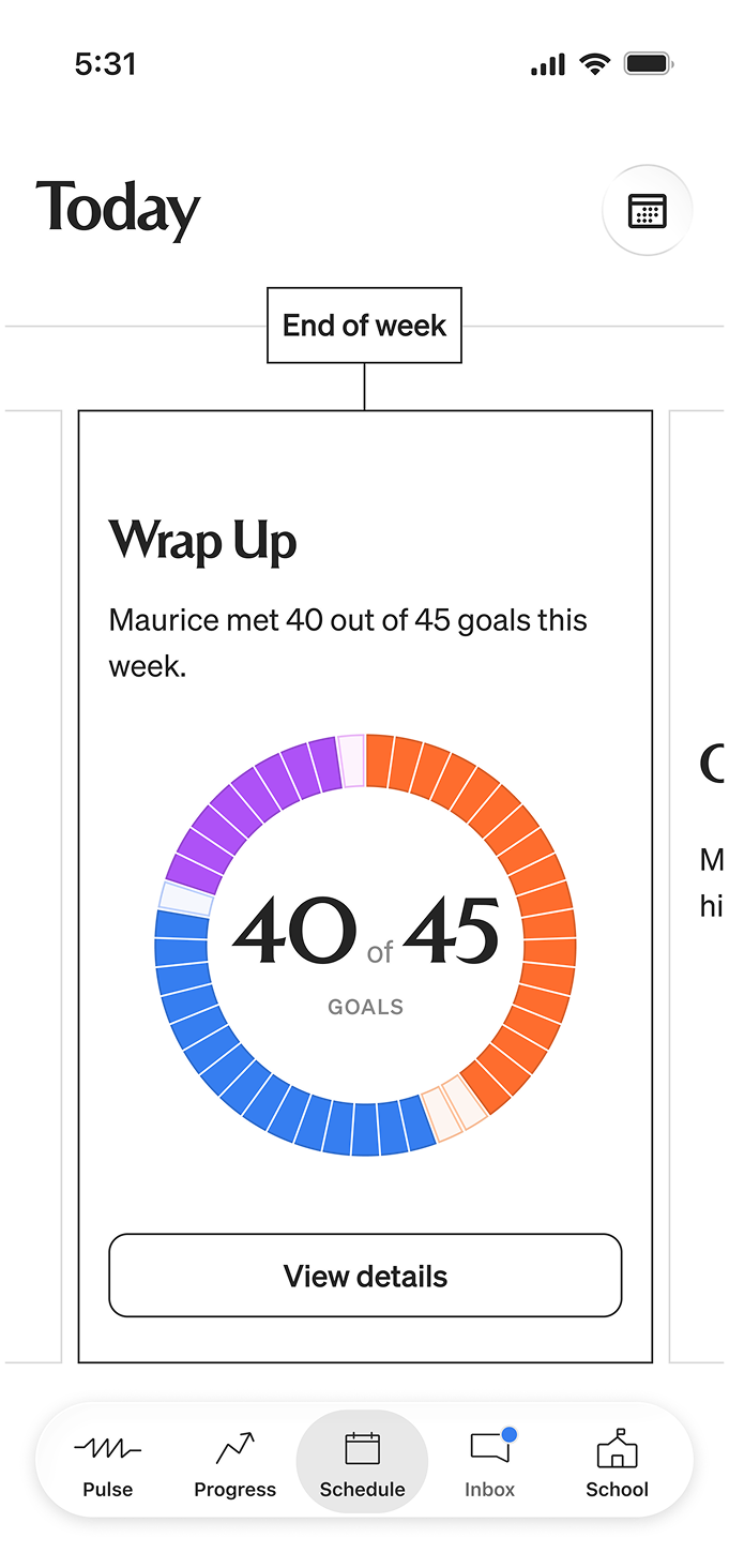
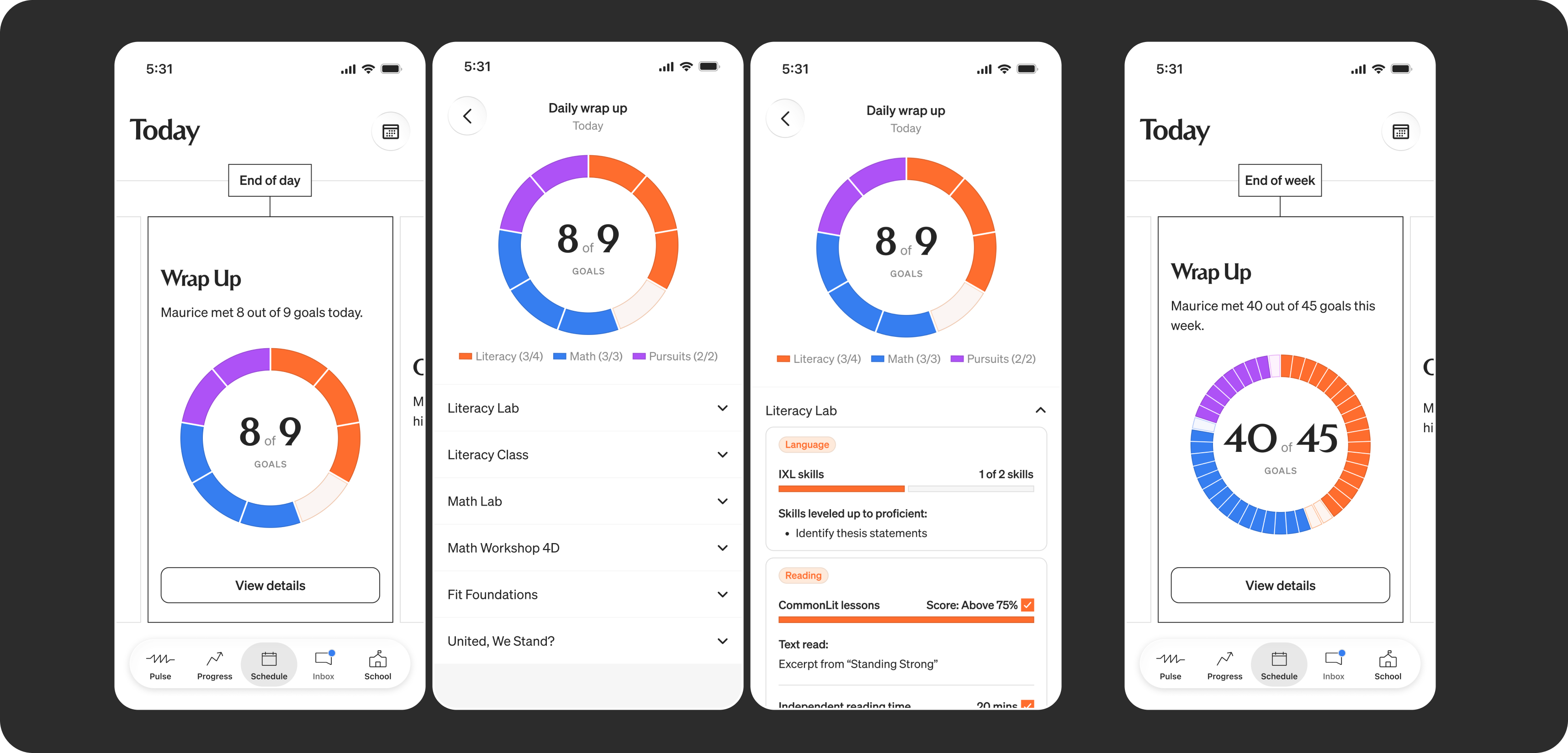
Each day has a wrap up that allows parents a high level view into their child's day, with the ability to dig deeper if they want. Then, at the end of each week, there's a weekly wrap up.
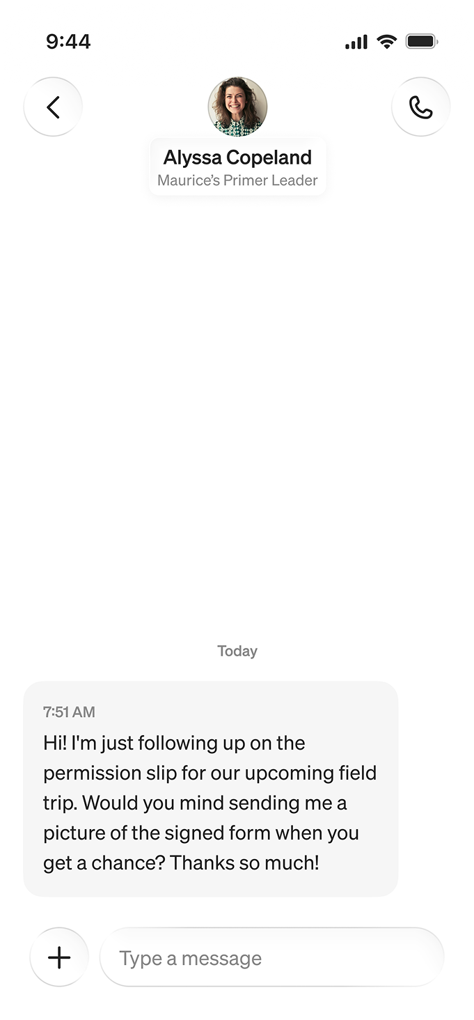
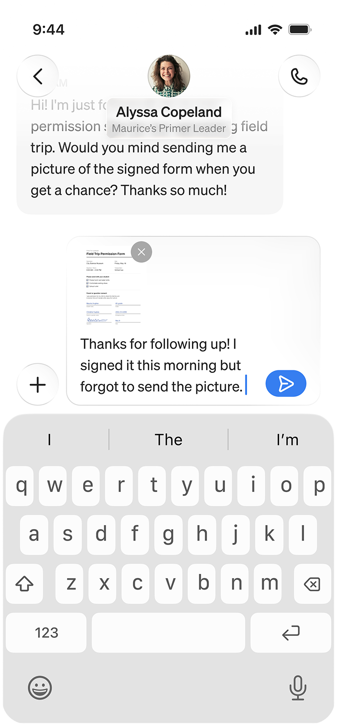
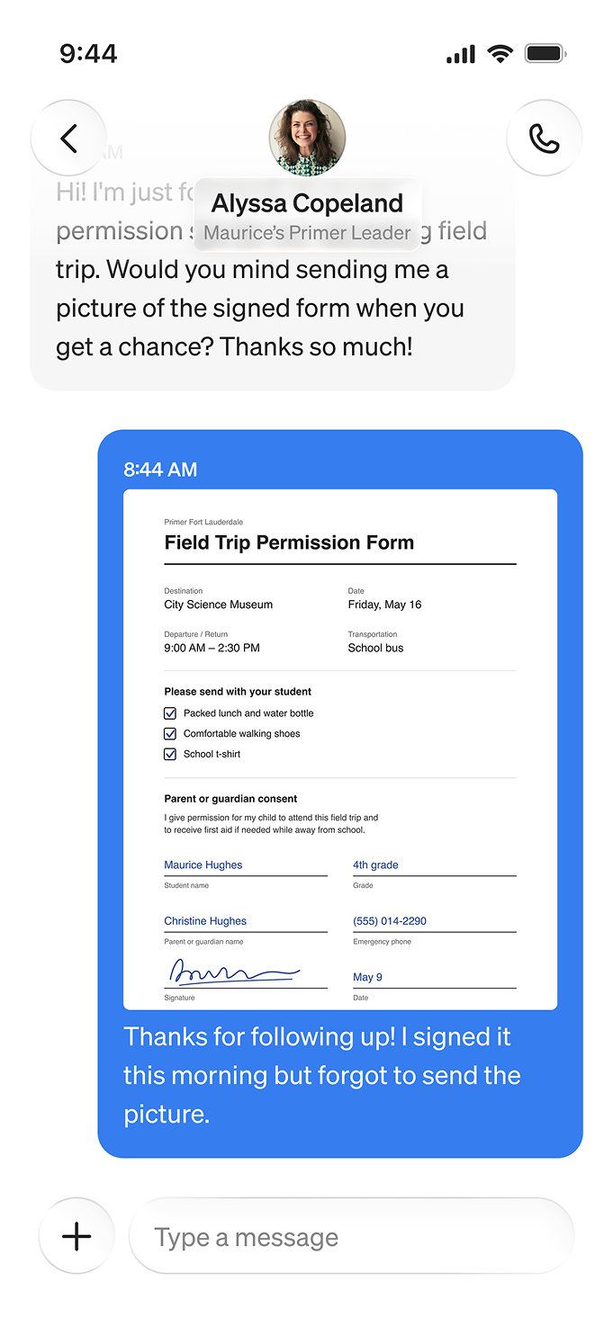
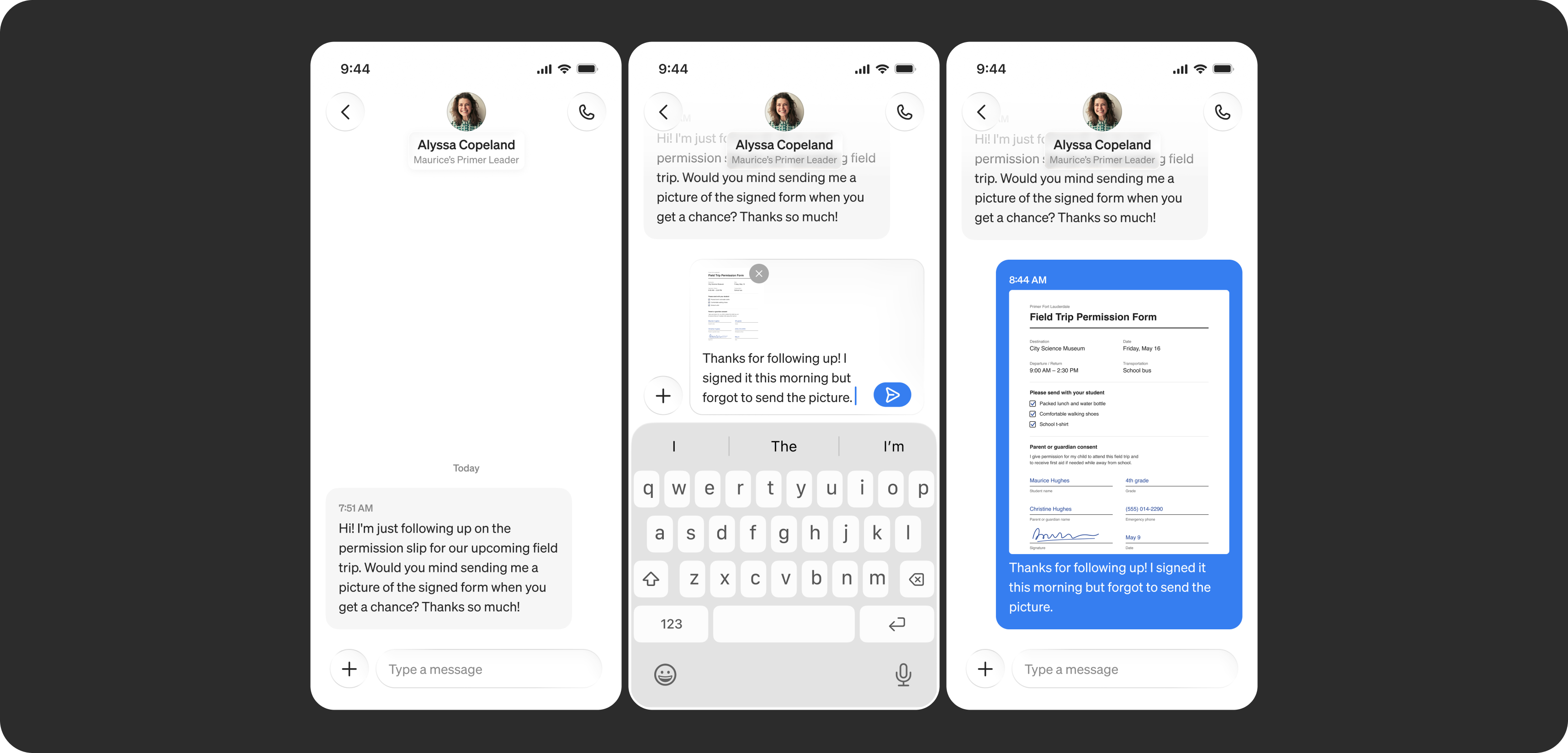
Parents and teachers can communicate easily and directly in the inbox.
Easier direct communication
The app introduced a dedicated inbox, so parents and teachers could message each other directly without personal phone numbers or long email chains. Each conversation keeps its context, so when a teacher asks for something like a signed permission form, the reply lands in the same thread.
Teachers are able to schedule messages for future times to keep school boundaries firm, and signal to parents that they will only message during certain times.
The visual design for the inbox is meant to look premium, and more like iMessage so that it is easy to use, and familiar for users that use iOS devices.
Working as part of Primer's team
Because we were embedded with Primer's in-house team, the app was designed alongside the rest of the product, from the teacher tools that created announcements to the student goal data parents could see. I worked closely with the lead product designer, Primer's engineers, and PM through weekly reviews to push the app to be the best it could be for Primer parents.
The outcome
The first version shipped to iOS and Android in fall 2025. Daily active users grew by 50%, and 85% of parent engagement now happens in the app. Parents have one place to follow their child's school day, and teachers can keep school communication in school channels.