Graphic Design
Article Patterns
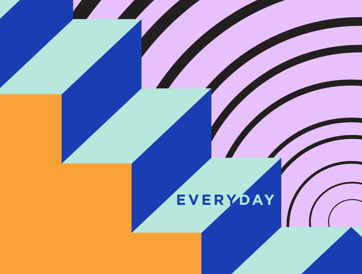
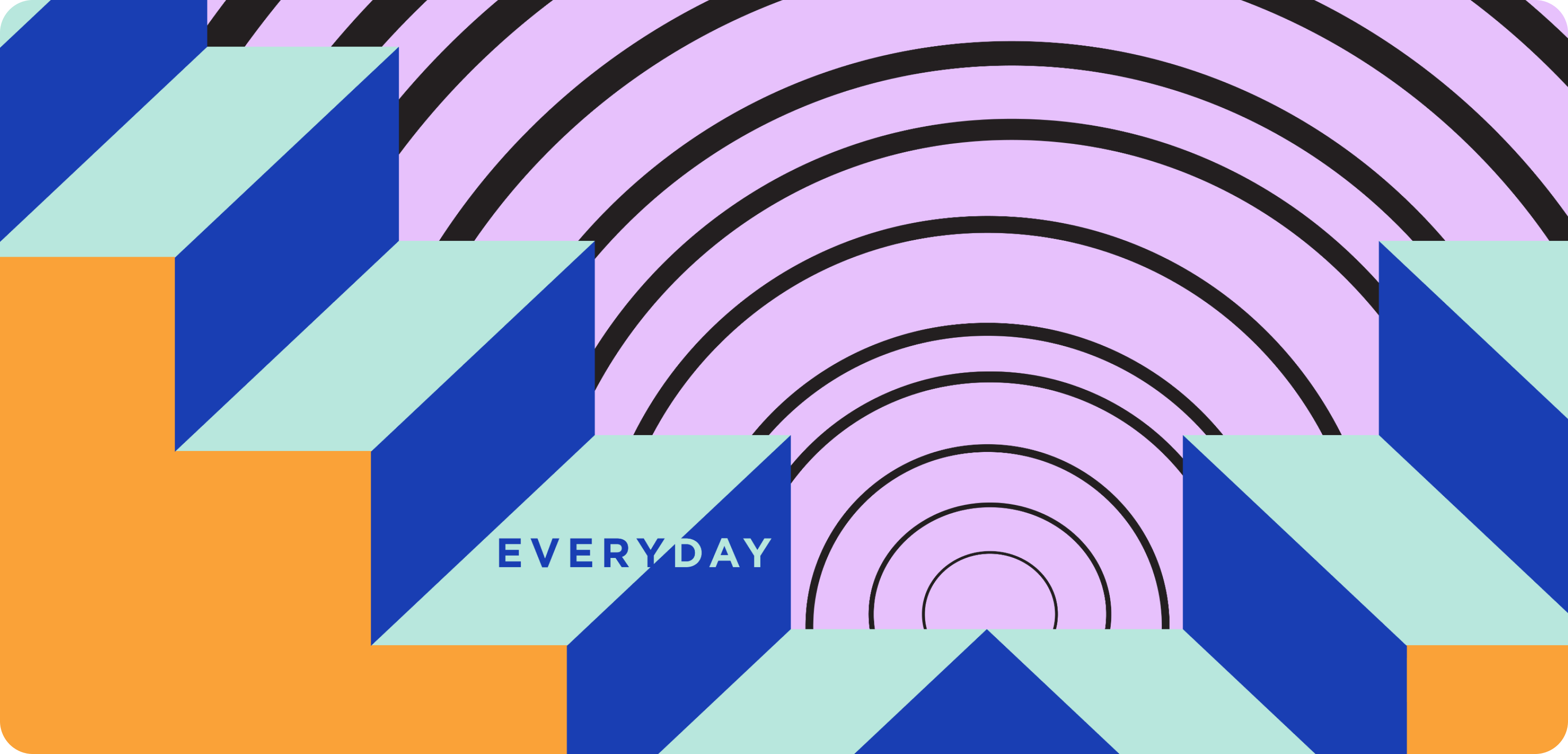
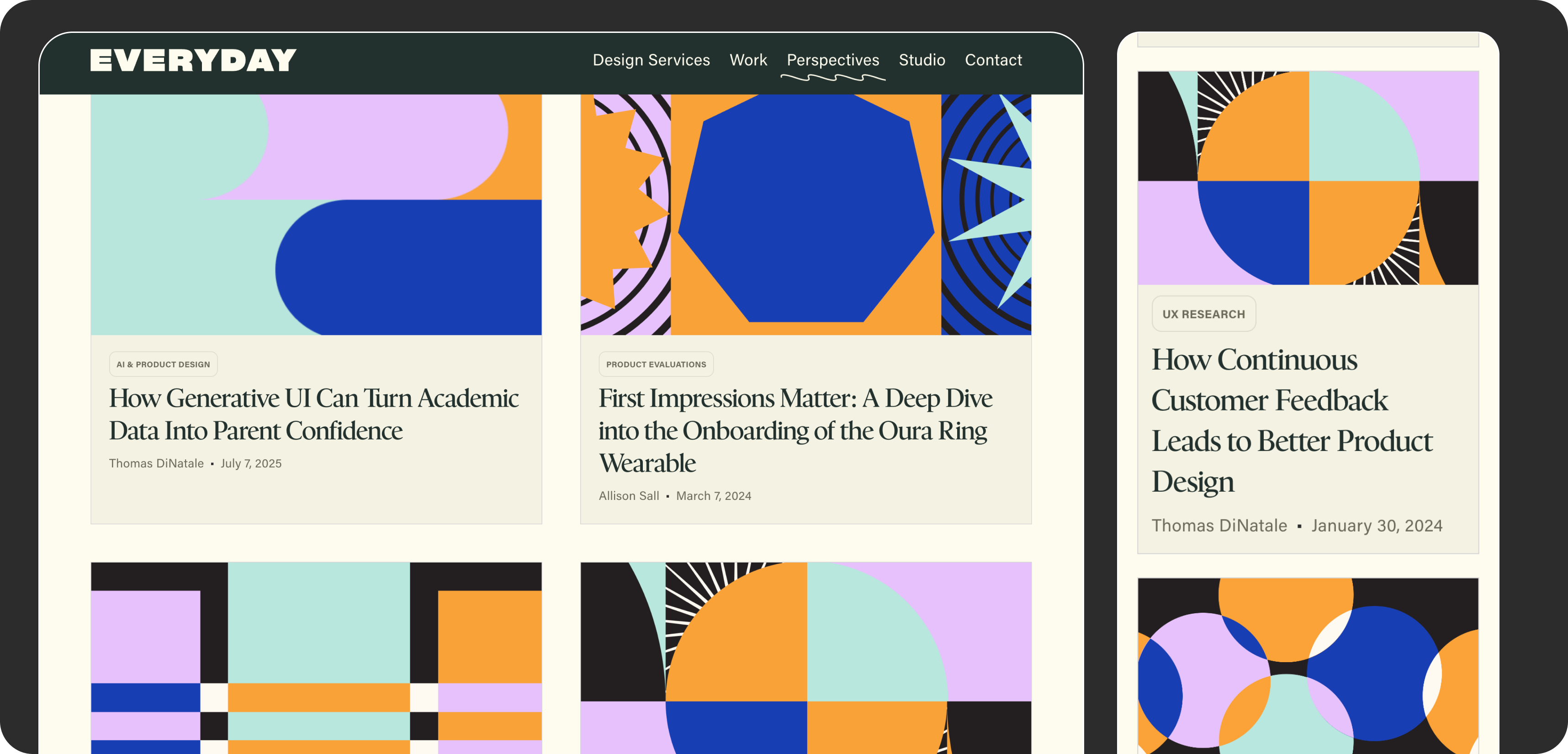
Members of the Everyday Industries' team regularly wrote articles about design, research, and product strategy, but each one was illustrated with stock photography that looked like every other agency blog. I designed a library of branded pattern images to replace them, giving every article a look that was unmistakably Everyday's.
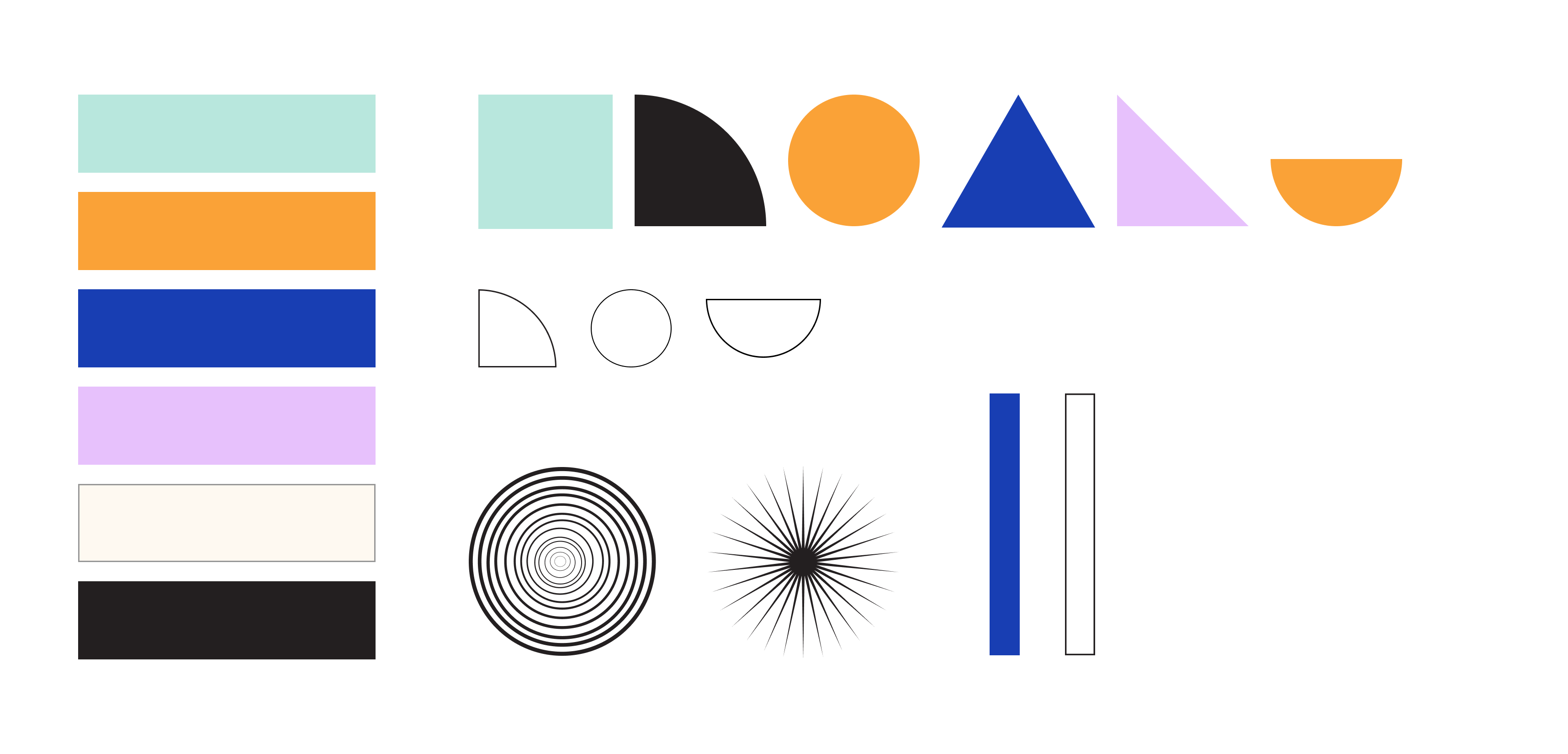
Building from a kit
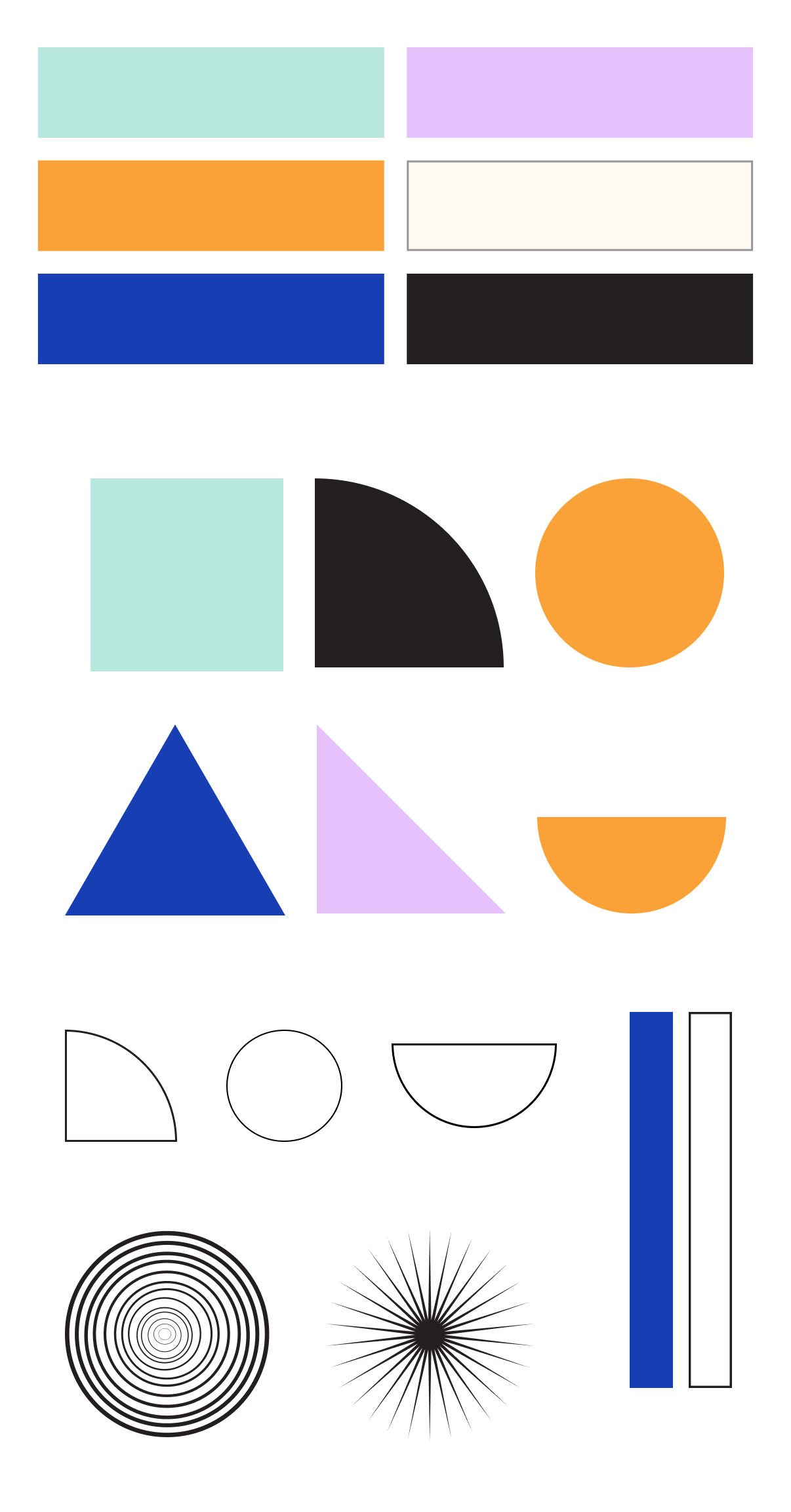
I started by defining a small set of colors and simple shapes: quarter circles, half circles, triangles, concentric rings, starbursts, and stripes. Every pattern was built from that same kit, so even very different designs feel like part of one family. The colors were inspired by Everyday's previous brand, but have continued to be used even after the rebrand.
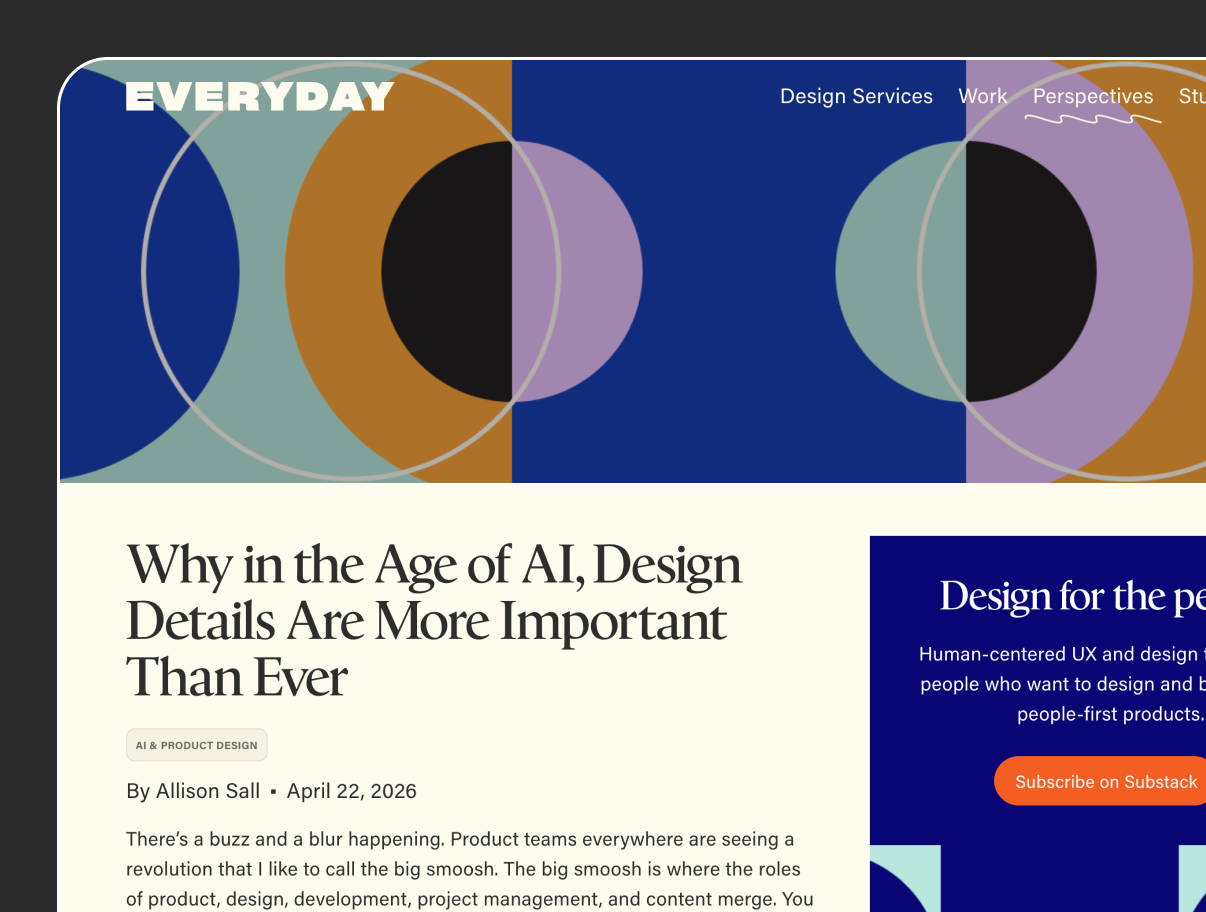
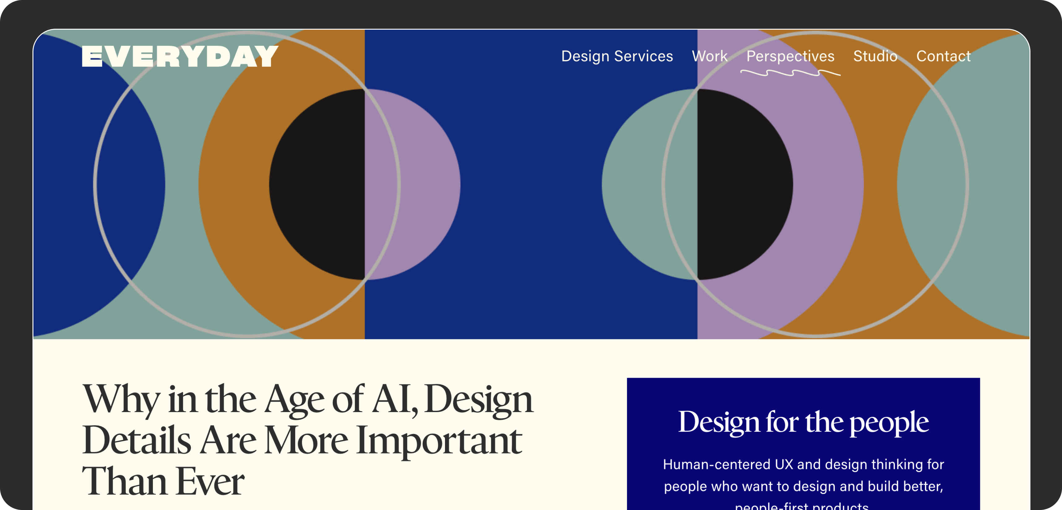
Patterns for every article
From the kit, I designed 50+ patterns in themes like circles, stairs, stripes, and starbursts, each one bold enough to stand out in an article feed. Each pattern was exported in several sizes, from wide article headers to square thumbnails and social images, so writers could use the same image everywhere their article appeared. The writer would choose a pattern from the library that they felt matched the article's topic in an abstract way, and would label which article it was being used for.
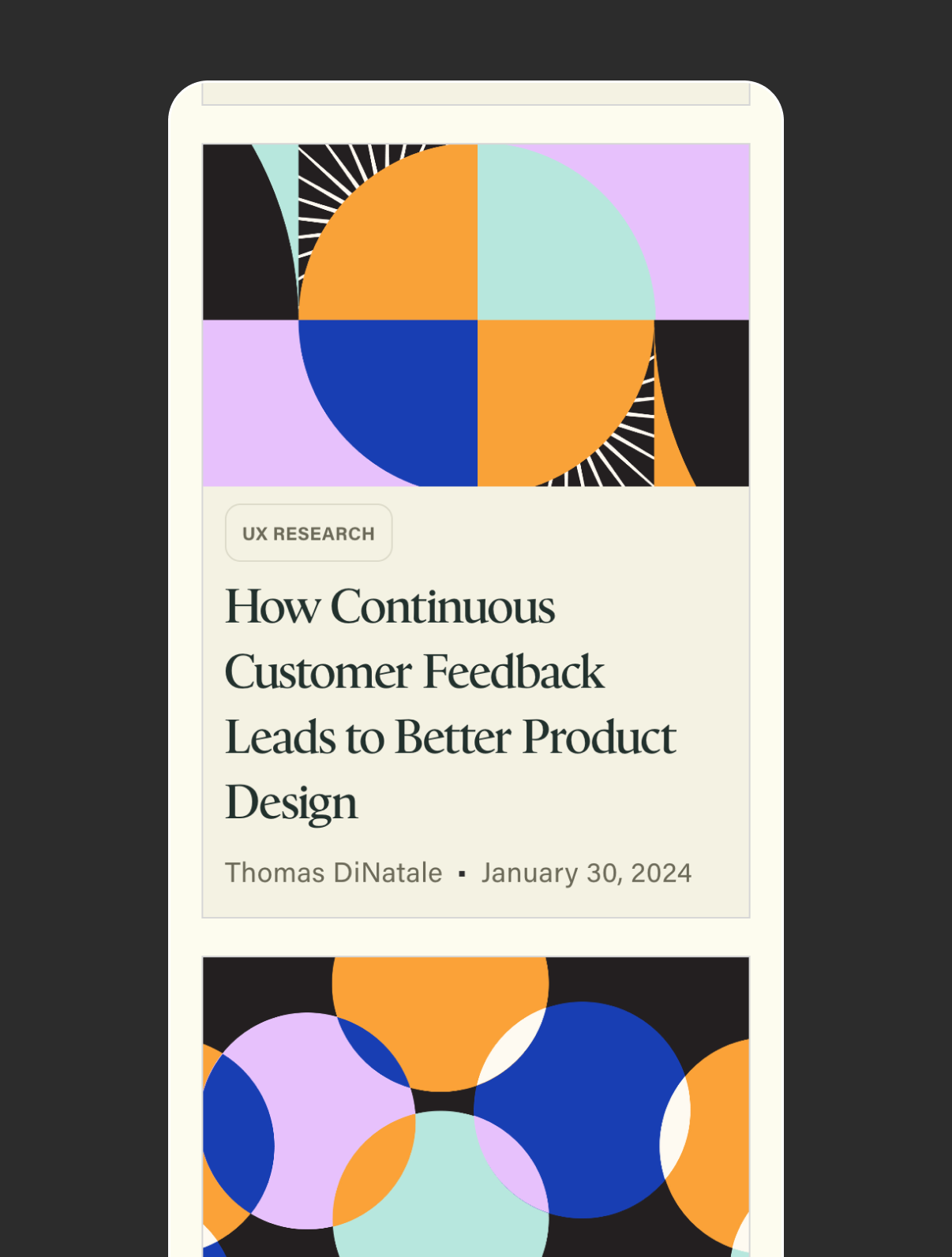
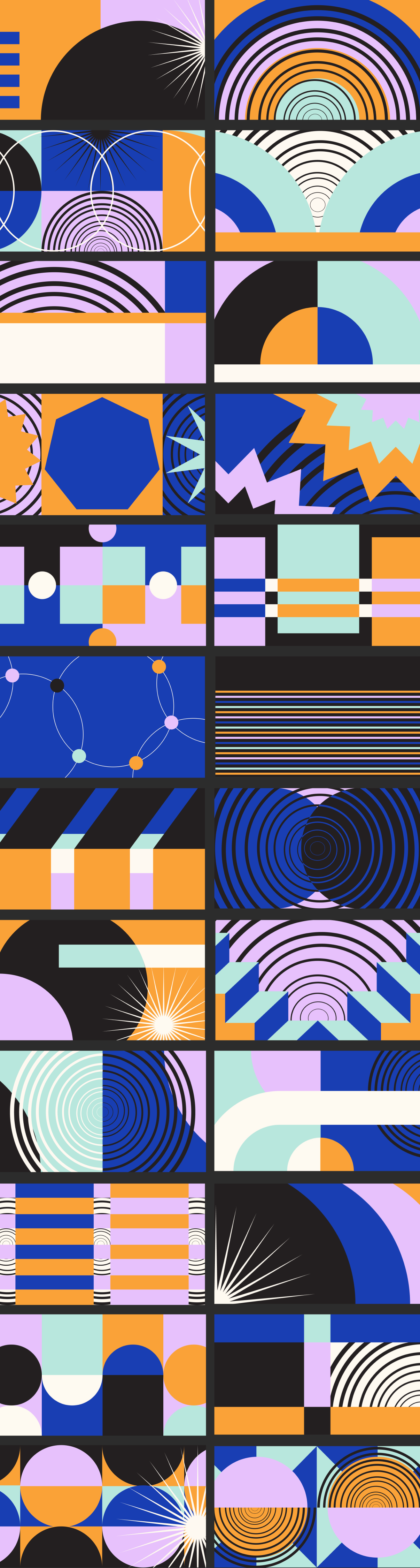
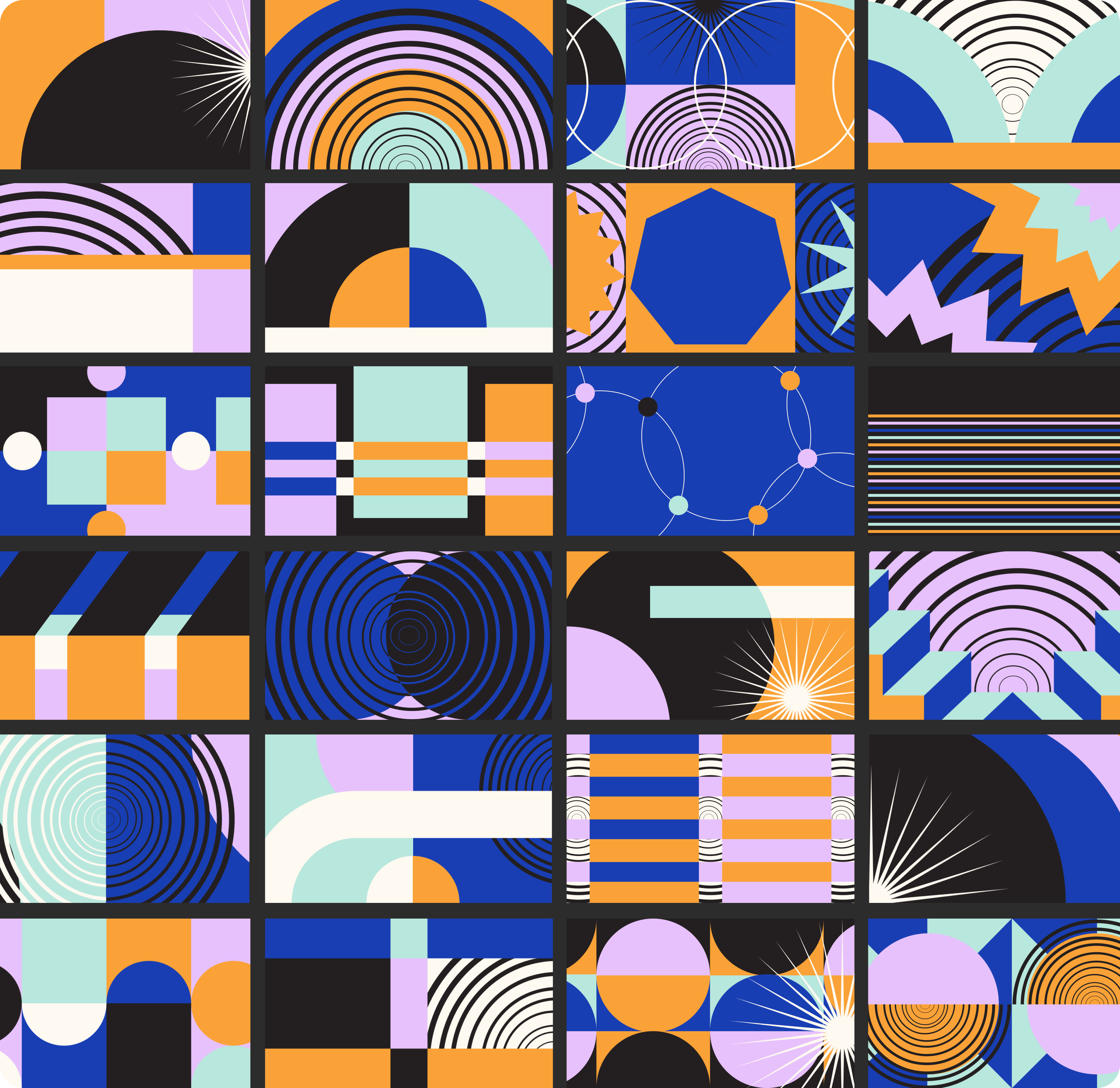
This was one of my favorite projects to work on. Once the kit was in place, each new pattern felt like a small puzzle: rearranging the same shapes and colors into something that felt fresh. The constraints made it easy to work fast, and I loved seeing how many different patterns could come from such a simple set of pieces.
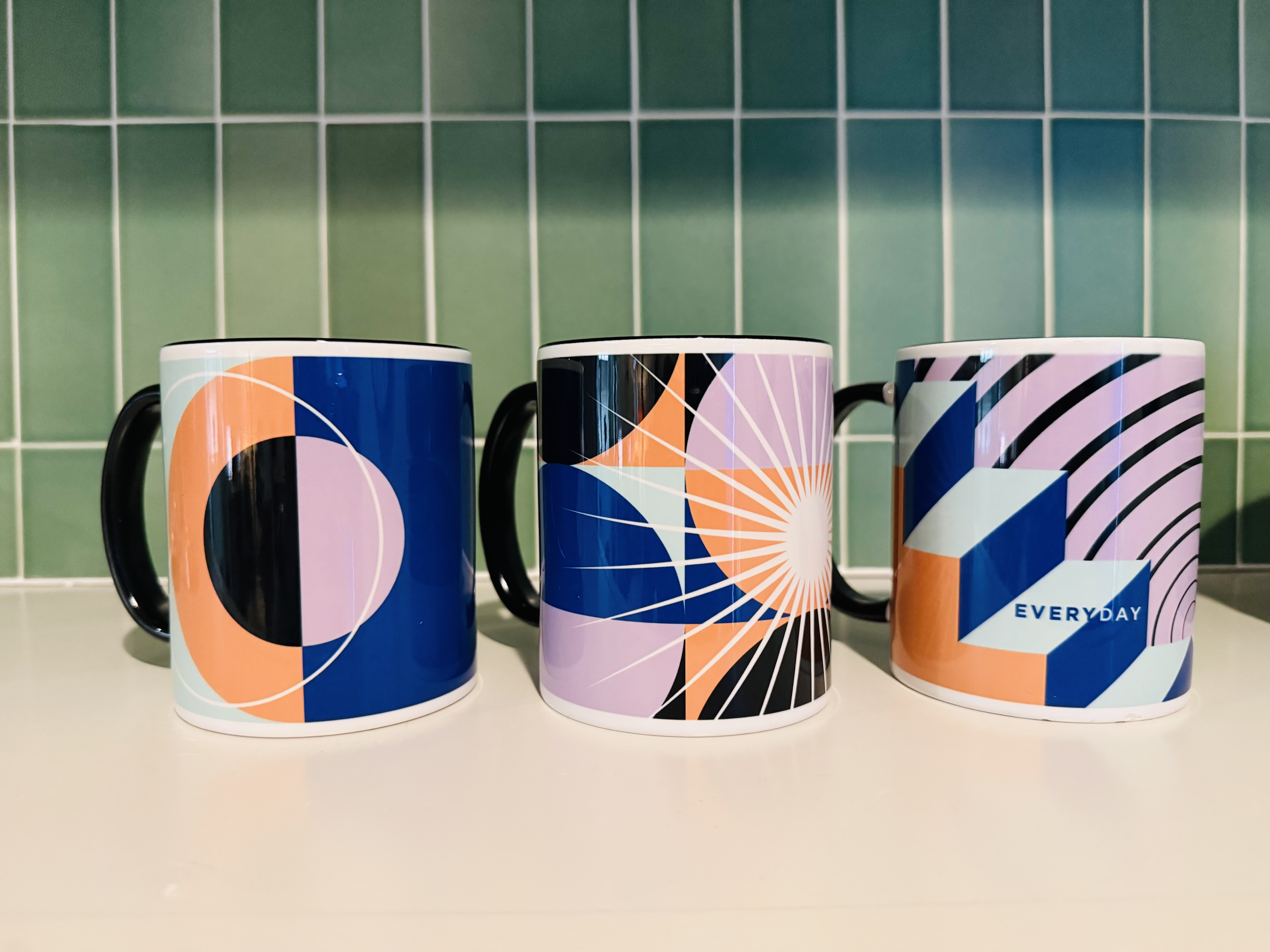
From screen to mug :)
The patterns became such a recognizable part of Everyday's brand that the team turned some of them into coffee mugs! :)