Graphic Design
Moore's Marinades
Moore's Marinades needed fresh, consistent social content every month, without the budget for a photo shoot. I designed their monthly social posts and most of their social ads, building on a refreshed look created by a Creative Director.
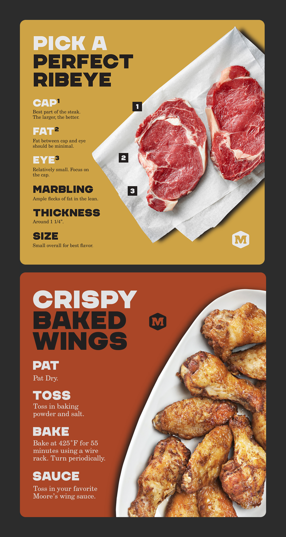
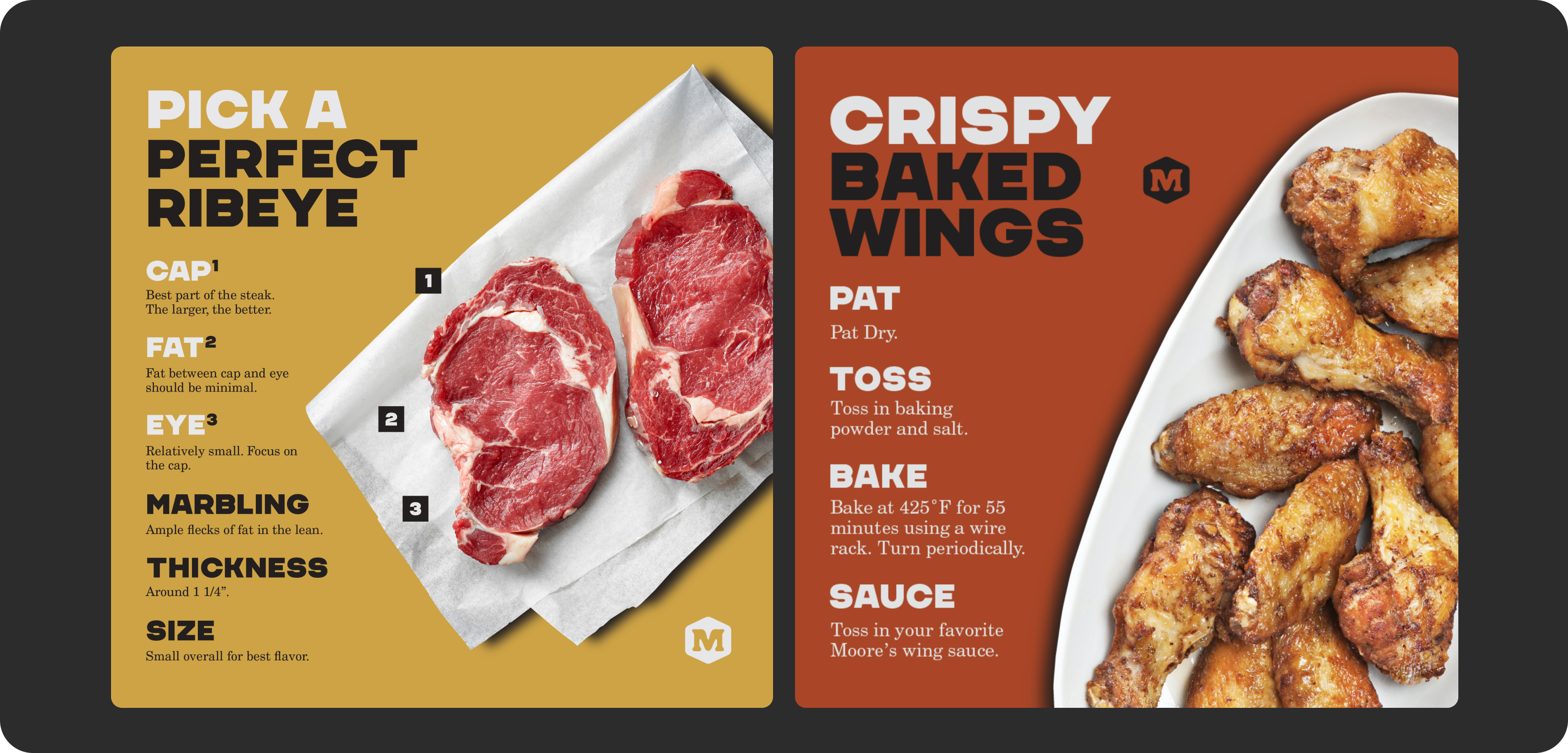
Using stock photography, Moore's typeface and colors, I continued the design for a series of recipe social posts.
Making stock feel like a brand
Each month, our content team outlined the ideas and wrote the copy for every post, and I designed the visuals, finding and treating the right stock images to bring each idea to life. With no budget to shoot, we relied on stock photography and user-generated content. The challenge was making images from many different sources feel like they came from one brand. By using consistent color treatments, bold type overlays, a recurring layout system, and careful image selection that matched the brand's tone, I could make the stock photos work well for what we needed.
Reach and traffic ads for the Perk Up Your Plate campaign that ran on socials during the Superbowl.
Ads that stop the scroll
For paid social, I designed ads that put the product and a bold, simple message up front, so they worked in a split second of scrolling. These used motion to draw attention and show imagery as well as text.